Thanks to the persistence of my colleague Prof. Ty Drake, HMCT now has two billboard spaces available for the display of student projects adjacent to the 950 building south parking lot. After Ty’s students’ work inaugurated the spaces, they were recently pasted over with 6 x 3 ft. posters from my Graduate Typography 3 class.
In a relatively short 4-week assignment, the students are asked to design a modular display typeface created from a base grid or set of standardized graphic components. The typefaces need to have a full twenty-six character set, either upper case, lower case, or unicase, as well as numerals. The typefaces must have their own evident internal formal logic, with no hand-drawn curves or arbitrary shapes.
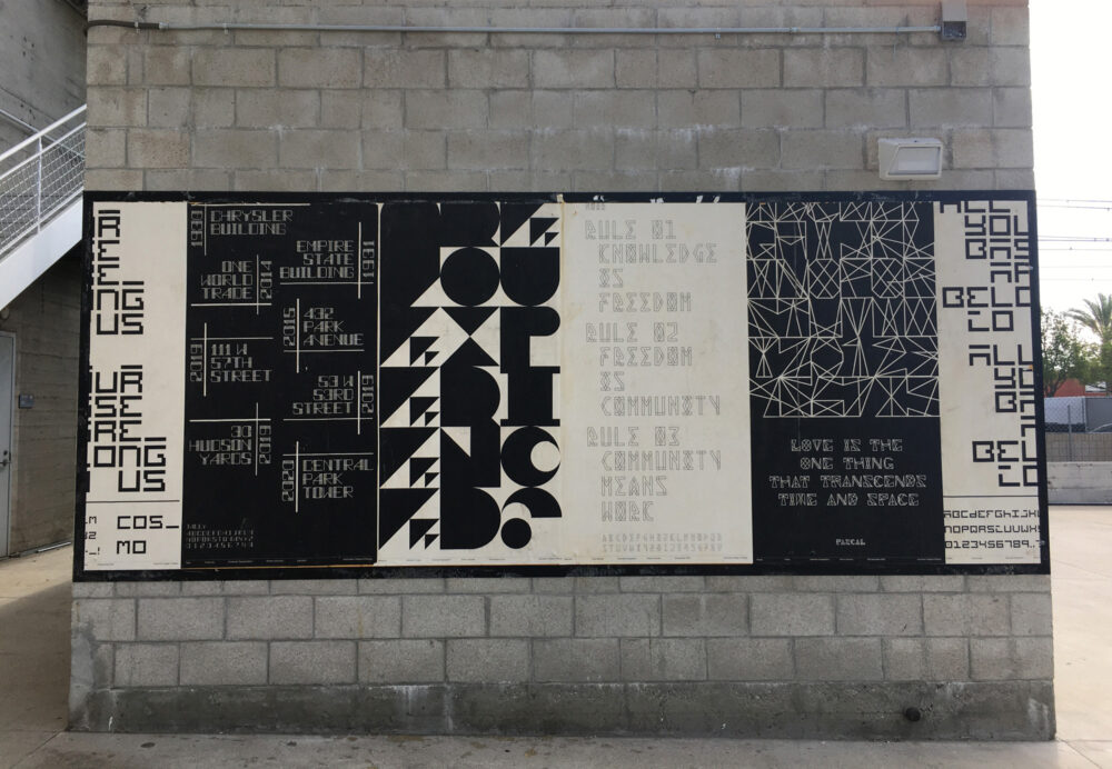
After initial exercises of five or six proposed directions, the most promising one or two are chosen and developed before determining which one to complete. The developmental process is always an interesting journey, as some students start with a definite goal in mind; for example, Kizzy Memani had just done a book project on Afro-Futurism and wanted to continue the theme and created a typeface called Neo Noir, which corresponded with that sensibility (see image 2 poster Rule 01 Knowledge is Freedom). I also encourage students to experiment with no definite goal in mind but just to be open to the process and see where it takes them so that they can then subsequently reverse into the conceptual parking space as it were, post-rationalizing their formal experiments. The usual dogma that you have to have a concept before you develop form only works up to a certain point. Designers are able to experiment with the language of form to generate new concepts. It is a form of pure research and a valuable part of our working methodology.
Once a resolved set of characters has been finished, the students are then asked to design a poster using language or statements which they feel accord with and amplify the feeling of the typeface. This is not an exact science, but an always interesting discussion about how we read meaning in form. They also have to give the typeface an appropriate name.
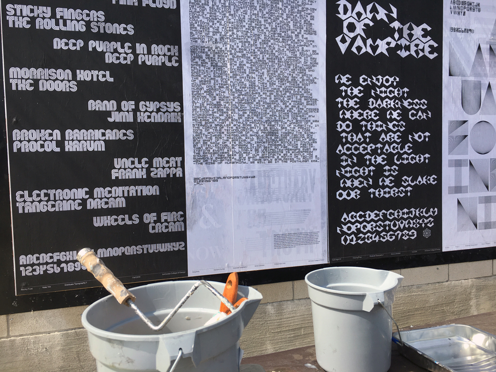
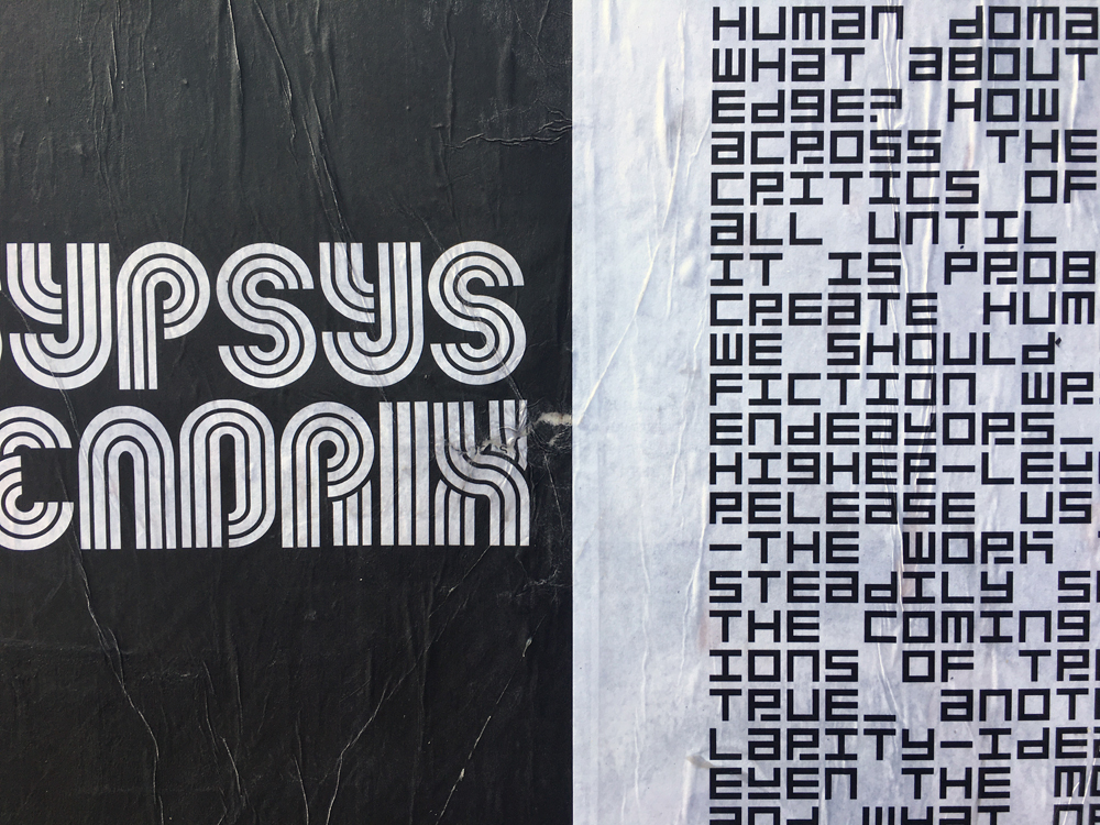
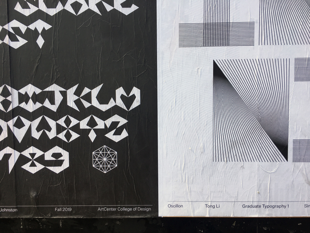
Looking at the first three varied examples in the main image from left to right: Yoko Yin’s experiments with multiple lines and fixed radii resulted in a font she called Rocky, with a late 60s/early 70s feeling and so her text reflected that, using names of bands and albums released in that period; Hampton Dunlap’s unicase monospace typeface Singularity had a futuristic technological modularity to it, was based on a 5×5 square grid using only verticals and horizontals, and worked well as a dense text on the subject of a posthuman era; Xiaoying Ding’s typeface Dark Night Elf was all based on the hexagram structure seen at the bottom right of her poster, resulting in the sharp/vampire/horror sensibility reflected in her poster text.
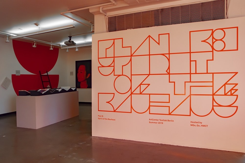
Hampton Dunlap finished two typefaces, one discussed above, as well as one called Moscoso constructed from simple geometric shapes, each letterform a square which was then used with no letterspacing or leading, all forms butting together and stacked (see image 2 poster Are You Experienced?). It was so strong we ended up using it for the typographic identity of the Plan B: Spirit of the Bauhaus exhibition at HMCT in 2019.
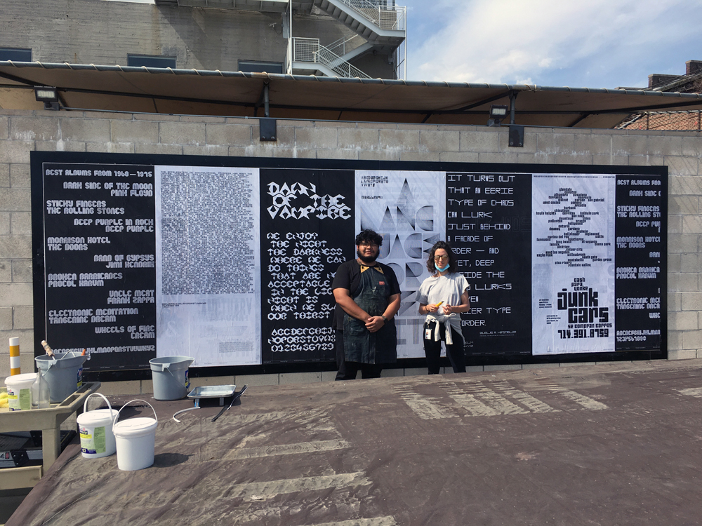
Special thanks to the HMCT team of Lavinia Lascaris and Joshue Molina for their wheat pasting achievements!
Character Building
Thanks to the persistence of my colleague Prof. Ty Drake, HMCT now has two billboard spaces available for the display of student projects adjacent to the 950 building south parking lot. After Ty’s students’ work inaugurated the spaces, they were recently pasted over with 6 x 3 ft. posters from my Graduate Typography 3 class.
In a relatively short 4-week assignment, the students are asked to design a modular display typeface created from a base grid or set of standardized graphic components. The typefaces need to have a full twenty-six character set, either upper case, lower case, or unicase, as well as numerals. The typefaces must have their own evident internal formal logic, with no hand-drawn curves or arbitrary shapes.
After initial exercises of five or six proposed directions, the most promising one or two are chosen and developed before determining which one to complete. The developmental process is always an interesting journey, as some students start with a definite goal in mind; for example, Kizzy Memani had just done a book project on Afro-Futurism and wanted to continue the theme and created a typeface called Neo Noir, which corresponded with that sensibility (see image 2 poster Rule 01 Knowledge is Freedom). I also encourage students to experiment with no definite goal in mind but just to be open to the process and see where it takes them so that they can then subsequently reverse into the conceptual parking space as it were, post-rationalizing their formal experiments. The usual dogma that you have to have a concept before you develop form only works up to a certain point. Designers are able to experiment with the language of form to generate new concepts. It is a form of pure research and a valuable part of our working methodology.
Once a resolved set of characters has been finished, the students are then asked to design a poster using language or statements which they feel accord with and amplify the feeling of the typeface. This is not an exact science, but an always interesting discussion about how we read meaning in form. They also have to give the typeface an appropriate name.
Looking at the first three varied examples in the main image from left to right: Yoko Yin’s experiments with multiple lines and fixed radii resulted in a font she called Rocky, with a late 60s/early 70s feeling and so her text reflected that, using names of bands and albums released in that period; Hampton Dunlap’s unicase monospace typeface Singularity had a futuristic technological modularity to it, was based on a 5×5 square grid using only verticals and horizontals, and worked well as a dense text on the subject of a posthuman era; Xiaoying Ding’s typeface Dark Night Elf was all based on the hexagram structure seen at the bottom right of her poster, resulting in the sharp/vampire/horror sensibility reflected in her poster text.
Hampton Dunlap finished two typefaces, one discussed above, as well as one called Moscoso constructed from simple geometric shapes, each letterform a square which was then used with no letterspacing or leading, all forms butting together and stacked (see image 2 poster Are You Experienced?). It was so strong we ended up using it for the typographic identity of the Plan B: Spirit of the Bauhaus exhibition at HMCT in 2019.
Special thanks to the HMCT team of Lavinia Lascaris and Joshue Molina for their wheat pasting achievements!
SUGGESTED ARTICLES
2023 Typographer-in-Residence Fellow: Josiah Tersieff
A Visit to Tipoteca in Italy
The Daily Heller on Quasi