At the end of October, I had the opportunity to speak at the ATypI (Association Typographique Internationale) conference in São Paulo, Brazil, on the subject of “A 21st Century Typography Curriculum,” outlining the current and ongoing development of the typography classes taught within ArtCenter’s Graphic Design undergraduate program. I was also able to talk briefly about the goals of HMCT in relation to the curriculum and broader audience. Thankfully my talk was on the first day so I was able to enjoy the other (more interesting) presentations in the following days without having to constantly worry about refining my script.
The main themes at the conference were the current state of creating, selling, and licensing fonts, including the recent consolidation of retailers and the proliferation of new independent foundries; a colorful local focus on the history and current state of typography in São Paulo and Brazil; and several presentations that dealt with the historical and contemporary design of non-latin fonts, particularly for the new global smart phone audience.
Highlights amongst the speakers for me were Lucas de Groot, who has a 20 year history with the city, having designed his first font for a local newspaper; Ann Bessemans’ presentation about the concept of reading comfort; and Jan Middendorp’s take on the art, culture and business of type. Tributes were made to masters of typography recently lost: Adrian Frutiger and Hermann Zapf. There was also a lovely video from Fernanda Martins about the tradition of hand-painted names on small fishing boats in northern Brazil: https://www.youtube.com/watch?v=TH4xNys97sg
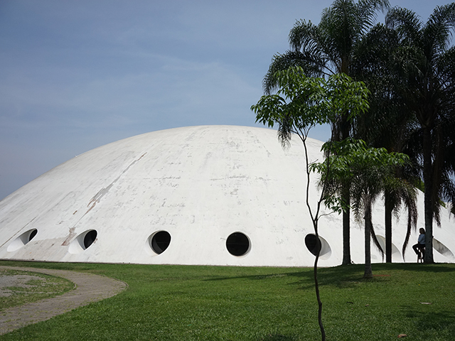
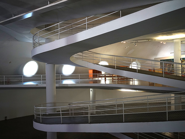
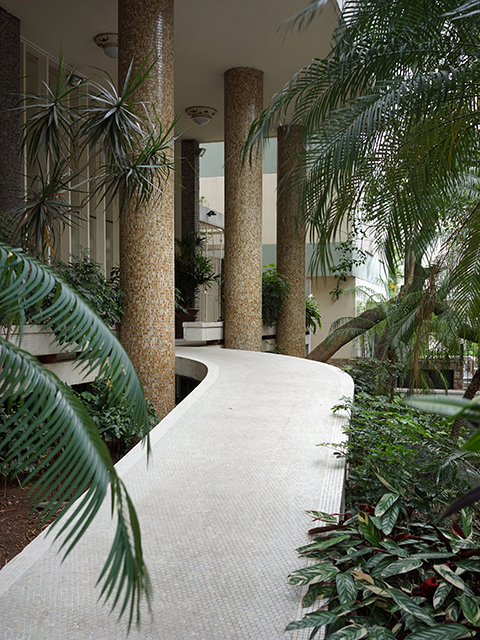
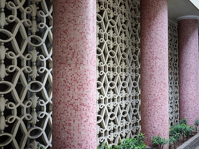
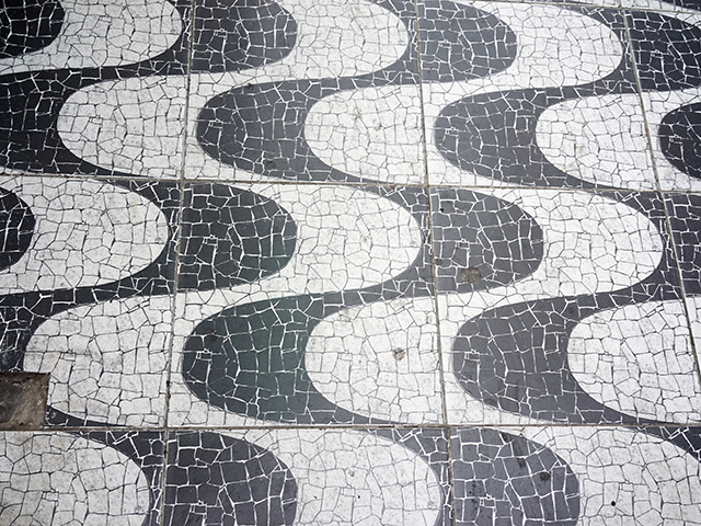
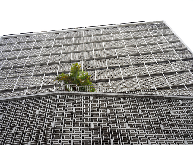
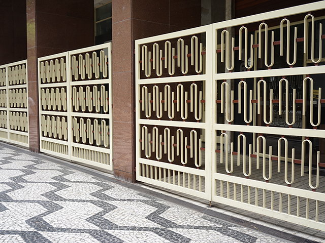
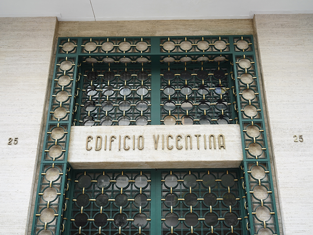
In addition to the illuminating talks, there was time for a guided type walk around the city center, and a side trip, or pilgrimage for me, to see the fabulous 1950s Oscar Niemeyer buildings in the Ibirapuera Park, in particular the dome-shaped flying saucer structure known as Oca. Brazilian modernism is a joy, with all of the cool rectilinear minimalism of European modernism but then suffused with a warmer, curvaceous sense of the flow of life.
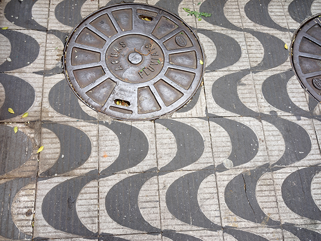
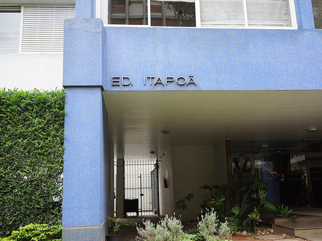
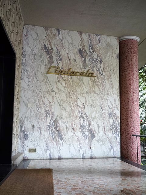
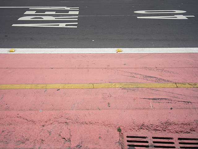
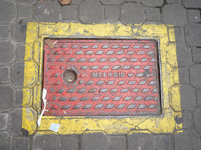
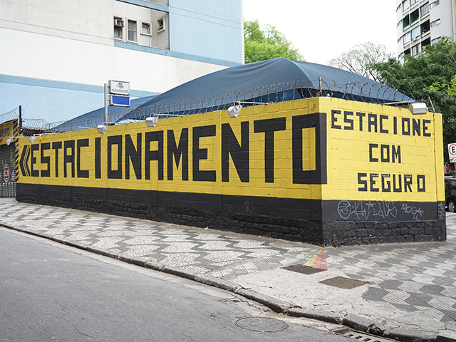
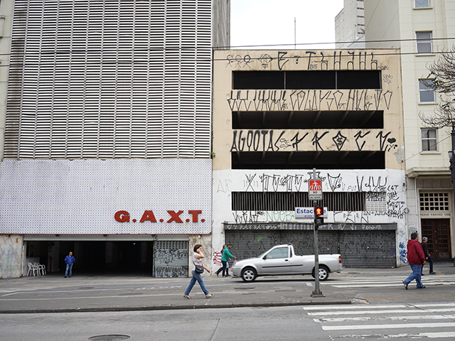
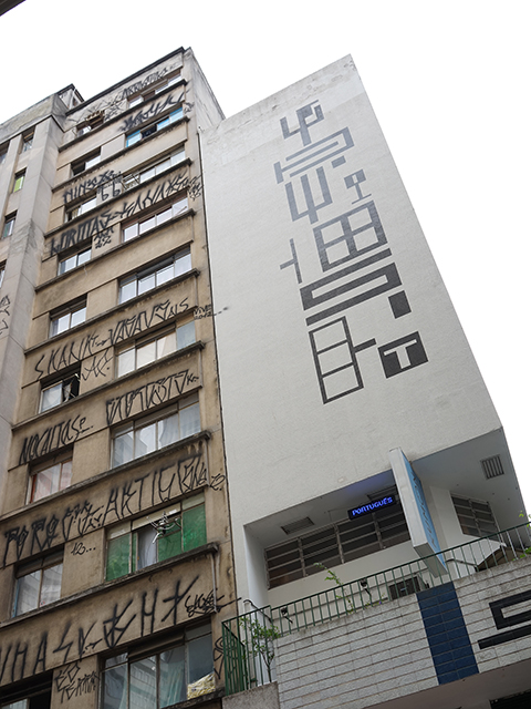
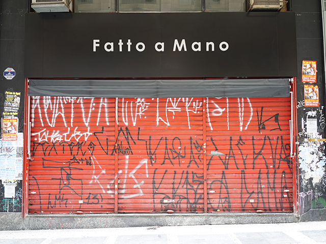
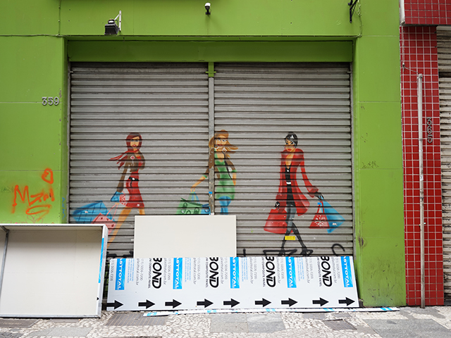
São Paulo is a fascinating, vibrant, sometimes elegant, sometimes not so much, city, and even home to some interesting-looking graffiti, not a phrase I thought I would ever write.
To the uninitiated, understanding the Portuguese language is difficult, as it looks like Spanish, and sounds like Polish. But the caipirinhas help (look it up). This was for anthropological research purposes only of course.
It was a pleasure to make new contacts in the typographic community, many of whom I will stay in touch with and hope will be able to visit and share their wisdom with us at the type center. It was my first time in the southern hemisphere, but I forgot to confirm if the water really does spiral down the sink in the opposite direction to the northern hemisphere. Obviously I will have to go back to check.
Kudos and obrigado to ATypI and the São Paulo team for hosting such a great conference. Conference pictures are here: www.flickr.com/photos/atypi/albums/with/72157661028211721
And the ATypI site has a very good past lecture archive: www.atypi.org