This summer, with the assistance of the HMCT, I was able to attend a wonderful Typographic Summer Program led by Dafi Kühne at his vast studio space located in the Swiss Alps. The week-long workshop aims to demystify the process of creating typographic contemporary posters using analog technologies.
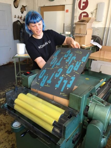
We began by experimenting with the letterpress printing process by focusing on achieving different textures and a variety of edge qualities by using various printing mediums including chipboard, glue, duct tape, thread, etc. What seemed like a careless and playful process was actually extremely precise, as we always had to make sure that the printing block height was within 0.05 of a millimeter of the type height. This process actually allowed for much more freedom in how letterpress can be used than I have ever experienced.
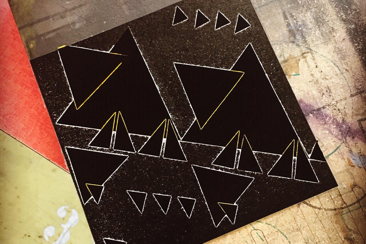
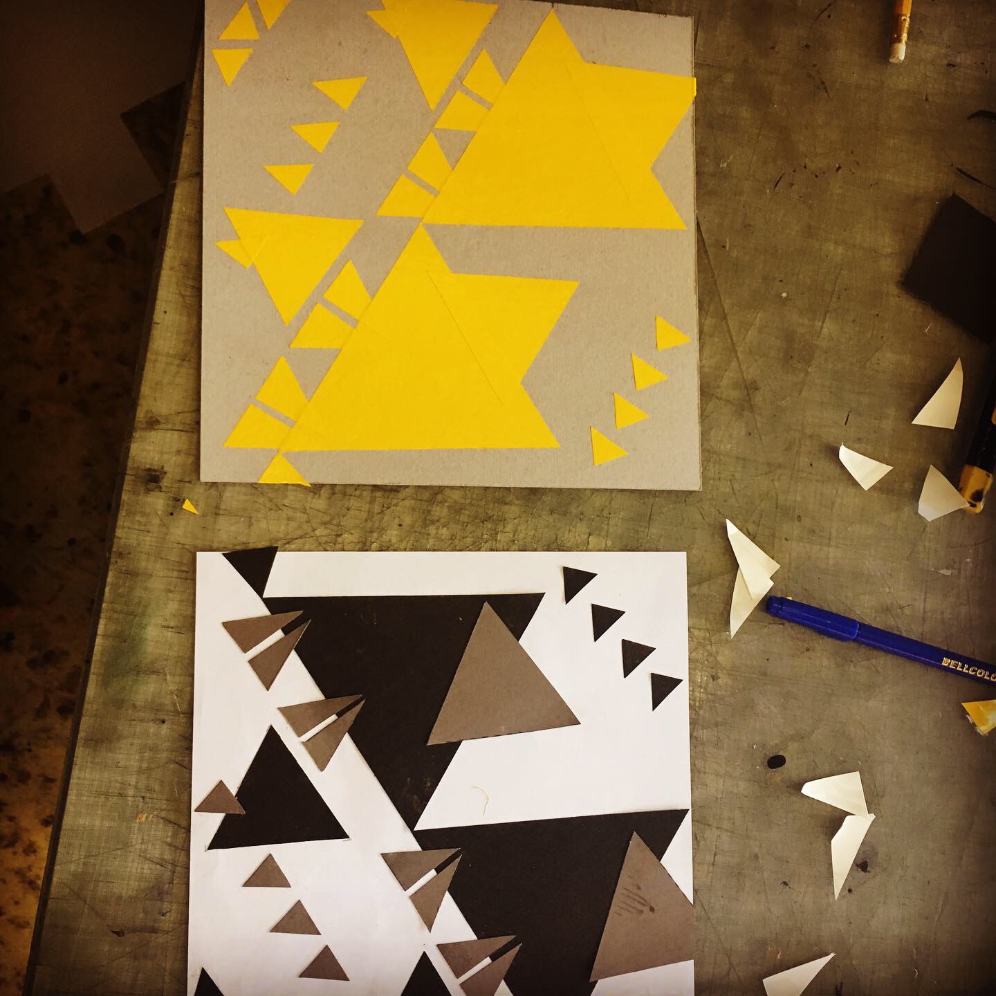
Following this, we did sketching exercises on using one simple geometric shape to express a single word. Going through this guided process of (roughly) 80 different iterations of one shape allowed me to see how the overall shape of the layout plays an important role in expressing the concept of the poster. It has led me to experimenting with different ideas, and has made me more comfortable in connecting the original layout to the concept.
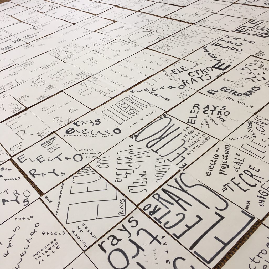
Next, a concept for the poster was developed and distilled into a couple of expressive words. The hand drawn sketches focused on expressing emotion, conveying powerful and compelling messages through typography only. Ideas were freely and playfully explored through hundreds of hand-drawn sketches. Most importantly, there was no focus on one certain style. Concept is always king, and the style of the poster must always serve its concept. In fact, Dafi and his guest speakers, Eric Brechbuhl, and Niklaus Troxler, continually stressed this point.
Ever since the workshop, my design process has drastically changed. Previously, I focused on image and typography simultaneously when creating a poster. Now I put the emphasis on typography—typography first! I am no longer bound by the image; I can use it if it serves the concept of the poster, or I can completely omit it—I have a choice. I no longer worry about creating a certain style or confining my design to a style. I allow the style to serve the concept. I am also more comfortable experimenting and playing with different ideas. The workshop has helped me make my design process open and less constrictive, and has allowed me to enjoy it more. Lastly, when using the letterpress printing process, I no longer think of any limitations of the medium. Instead, I look forward to experimenting and exploring new techniques and ideas.