HMCT is pleased to present an article paying homage to iconic SoCal designer John van Hamersveld, written by renowned designer, educator (currently a professor at CalArts) and friend of HMCT Louise Sandhaus.
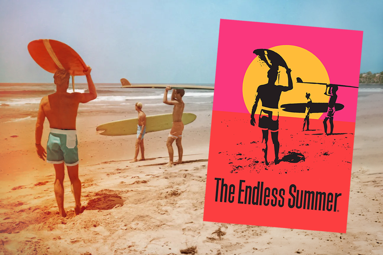
Over the last decade or so, John van Hamersveld (JvH) and I have been corresponding. I first reached out to him at the dawn of working on my book, Earthquakes, Mudslides, Fires & Riots. The exact shape of that project was a fuzzy blob in my head at the time; what was understood to be “California graphic design” wasn’t certain. But, still, something as iconic as John van Hamersveld’s Endless Summer poster seemed like a good place to start.
September 2012 was when I first met John in person at his place in Santa Monica. It seemed like in every nook and cranny of that apartment was John’s work. Much of it seemed familiar—part of my graphic design consciousness and/or the consciousness of pop and rock graphics of the 1970s and 80s. It was a vast career packed into room after room. If he and his partner Alida Post also lived there, the bed must have been on top of flat files.
What followed were years of email correspondence. (I’m not a phone person, and besides, having things in writing was much more useful.) The correspondence went something like this: A question or two from me followed by several generously over-flowing emails from John in response. Usually, they would contain images and often excerpts from his own writing about his work or the writing by others about him. Sometimes, the original question was answered; sometimes not. The correspondence was enlightening and sometimes frustrating—a sign of my impatience and lessons learned to chill lest I leap to inaccurate “factual” conclusions, like the oh-so-embarrassing attribution of type design to John when it was Victor Moscoso’s. 😳
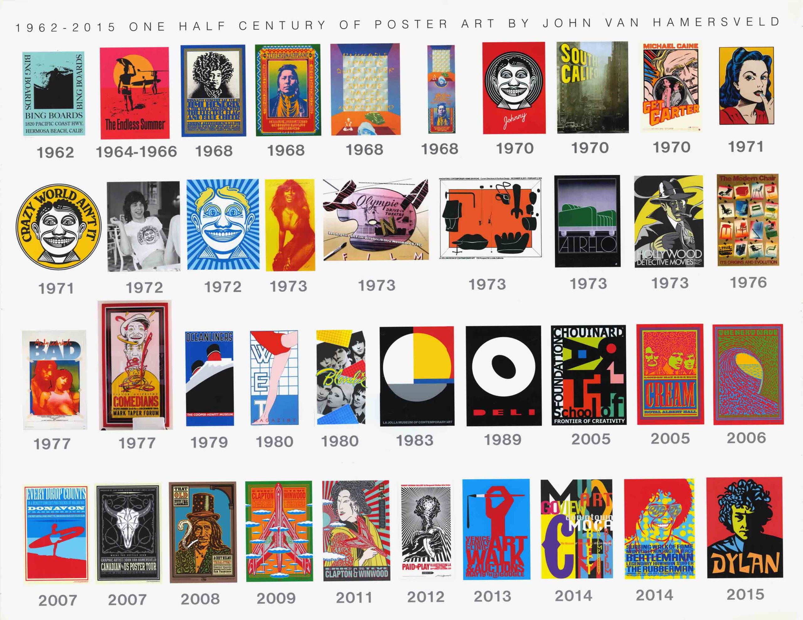
The arc of JvH’s career is less of an ambiguous cloud for me now. It has considerably more shape—a dimensional one. While he seems at first glance like the poster boy for…, well, California posters, there are so many more tangents to his career and to his contributions. John was at the intersection of several California cultural movements—what were described until recently as sub-cultures—from beach and surf culture, art, rock, hippie, and punk culture, through corporate culture, and back again. His roles in relation to those moments varied but include producer, entrepreneur, cultural connector, and general mover ‘n shaker, as well as his morerecognized roles as designer, art director illustrator, photographer, muralist, and artist. He also tried his hands at architecture and filmmaking.
These varied cultural shores begin with the Endless Summer film poster (1966) that JvH designed for Bruce Brown’s documentary surf film. The poster not only launched his career but also became a national emblem of a glowing California beach-and-surf dream for young—and probably mostly white male—Americans across the nation. And maybe beyond. The image evoked beaches and bleached-out tangled hair that thumbed its nose at a more buttoned-up, stick-to-the-rules society.
Early in JvH’s career, his affinity with surf culture elided into rock ‘n roll and hippie culture. Not the rebellious relevancy of these movements but the more fashionable versions. During a year-long stint (1967–1968) as an art director at Capitol Records, John created such iconic works for rock and roll music as the Beatles’ Magical Mystery Tour album cover (1968) and the design for the Rolling Stones’ album Exile on Main Street (1972). But there were many other album covers that preceded and followed. While at Capitol, he also formed Pinnacle Productions. It began as an idea for “happenings,” and with a little help from his friends, Pinnacle became an enterprise that realized immersive light shows. Created by filmmakers and artists, they were accompanied by “sounds” for dancing—preludes to the big rock shows that featured big-name bands to which the lighting extravaganzas were an integrated element.
John’s circle included Victor Moscoso and Rick Griffin, who were two of the “Big Five”—the most recognized of the San Francisco-based psychedelic poster artists. They also became part of the irreverent, psychedelic-infused Comix culture that emerged at the end of the 1960s, best emblematized by the “Zap Style” of Robert Crumb. JvH introduced a mouse character and twisted the comic graphic language into what he referred to as “pop art surrealism.” Trippy, it was.
From hippie to Comix, John sees his 1972 design for the Rolling Stones’ album Exile on Main Street—which he credits as a collaboration with Mick Jagger— as the beginning of the shift to a more “punk” aesthetic. Punk before punk, and punk sans its DIY spirit that anyone and everyone could do design. The idea used appropriated imagery intended to represent a spirit rather than the more conventional photo of the band members. In the case of the Exile cover, an image by Robert Frank of his own pinboard of circus “freaks” with the album title scrawled in red grease pencil in the upper left corner. (I was a Stones bad girl rather than a Beatles sugar-sweet one. I remember it well.)
Meanwhile, In 1975, JvH exhibited his masterful photographs documenting his experience of southern California life at USC’s Fisher Gallery as well as in a self-published book entitled T.V. Life. The works reflected how media created images so memorable that we began conflating them with our own real-life memories. John flipped the script, documenting images of his own experiences, thus reclaiming his own memory.
In 1984, JvH made his mark on the 1984 Summer Olympics in Los Angeles as a muralist and poster artist. While the graphic language of Deborah Sussman and Sussman Prezja still stole the show, JvH’s 360-foot mural that wrapped halfway around the stadium ran (haha—pun intended; it was a mural of runners!) with that memorable color palette—or at something similarly dazzling.
Then comes the computer age—the information age and what an amazing artist who can actually draw can do. Reinvent oneself for the “Communication Age,” where everything is a brand. Become a brand: John van Hamersveld 7.0. Celebrate past work; reprint; rerelease; create new posters; realize gigantic immersive experiences; complete expansive mural commissions; have your work celebrated in books; in exhibitions.
JvH didn’t just create the Endless Summer image but is an endless summer himself. He keeps on working—a glowing, vibrant ball on fire. A sun that never seems to set and in which we still seem to bask.
–Louise Sandhaus