HMCT’s Leah Hoffmitz Milken Fellowship offers international grants to educators teaching at the university level designed to expand and enhance their teaching pedagogy. Chosen applicants are embedded for one week in ArtCenter typography classes, where they observe, learn, and share. This year, Liz DeLuna, Professor of Graphic Design at Queens University, NY was on campus for one week during summer term. Liz shares her thoughts here on immersing herself in ArtCenter College typographic pedagogy.
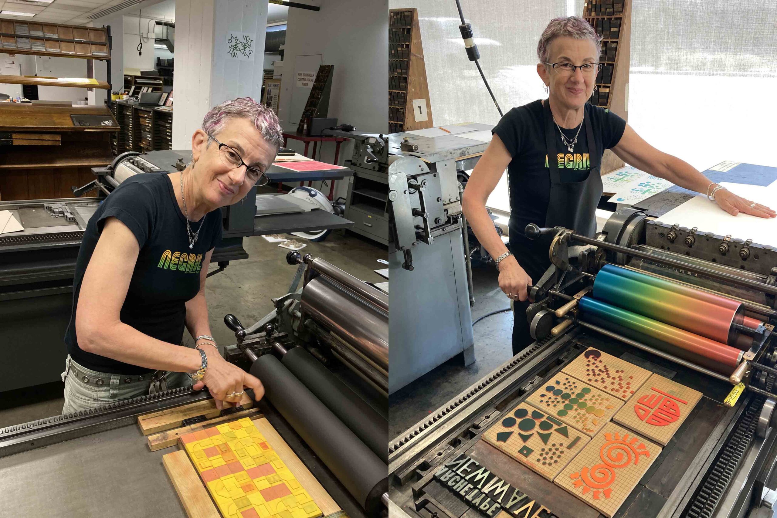
My week at ArtCenter began by getting my hands dirty at Archetype Press, HMCT’s phenomenal letterpress facility, in a workshop entitled New Wave, led by Janet Kupchick. The workshop introduced printers to the process of printing with alternative materials. We started printing with tape, string, and found objects, eventually moving on to more modular systems like flat (pixel-like) Lego tiles and P22 Blox, a set of modular printing blocks created for letterpress and based on Bauhaus principles of basic shapes and forms. This workshop was a great introduction to the community of HMCT and the exceptional ArtCenter facilities on South Raymond Ave.
The rest of the Fellowship week was spent attending classes, meeting faculty and students, touring the facilities, and perusing the HMCT archives. I was also fortunate enough to be on campus for the installation and opening of an exhibition of student typeface designs entitled Do You Have a Platypus? in the HMCT Gallery. The show featured posters created from FAQs as found in the wild, typeset with fonts designed by the students in instructor Greg Lindy’s Font Design class.
One of the beauties of design education is that design educators all have something unique to offer in the classroom. The classes I visited were all rigorous and interactive, and although there were noticeable similarities in structure, process, and foundational principles, each class was unique and immersive in its own way. Both students and faculty brought a level of care, rigor, curiosity, and a genuine passion for design and typography.
Some take-aways:
The graphic design program at ArtCenter and HMCT is rooted in educating design students in solid fundamentals and core principles, with five mandatory sequenced classes in typography. The curriculum and the student work all bear evidence of this solid underpinning in typography.
The studio classes are an intensive five hours long!!
Type 1 Foundation: I was inspired by the element of play that Matt Sahlit brought to the content of Type 1. Type 1 is traditionally a structured and rigorous class, but in this iteration, the students and the faculty were having fun with the content and parameters of the project. Matt’s class emphasized participation, and students were generous with their feedback and comments on each other’s work.
Type 2 Structure: In Type 2 the walls of the HMCT classroom were covered with shape and form and image and color and of course lots and lots of typography. Ty Drake has a dynamic personality and an engaging teaching style; five hours went by in a flash!
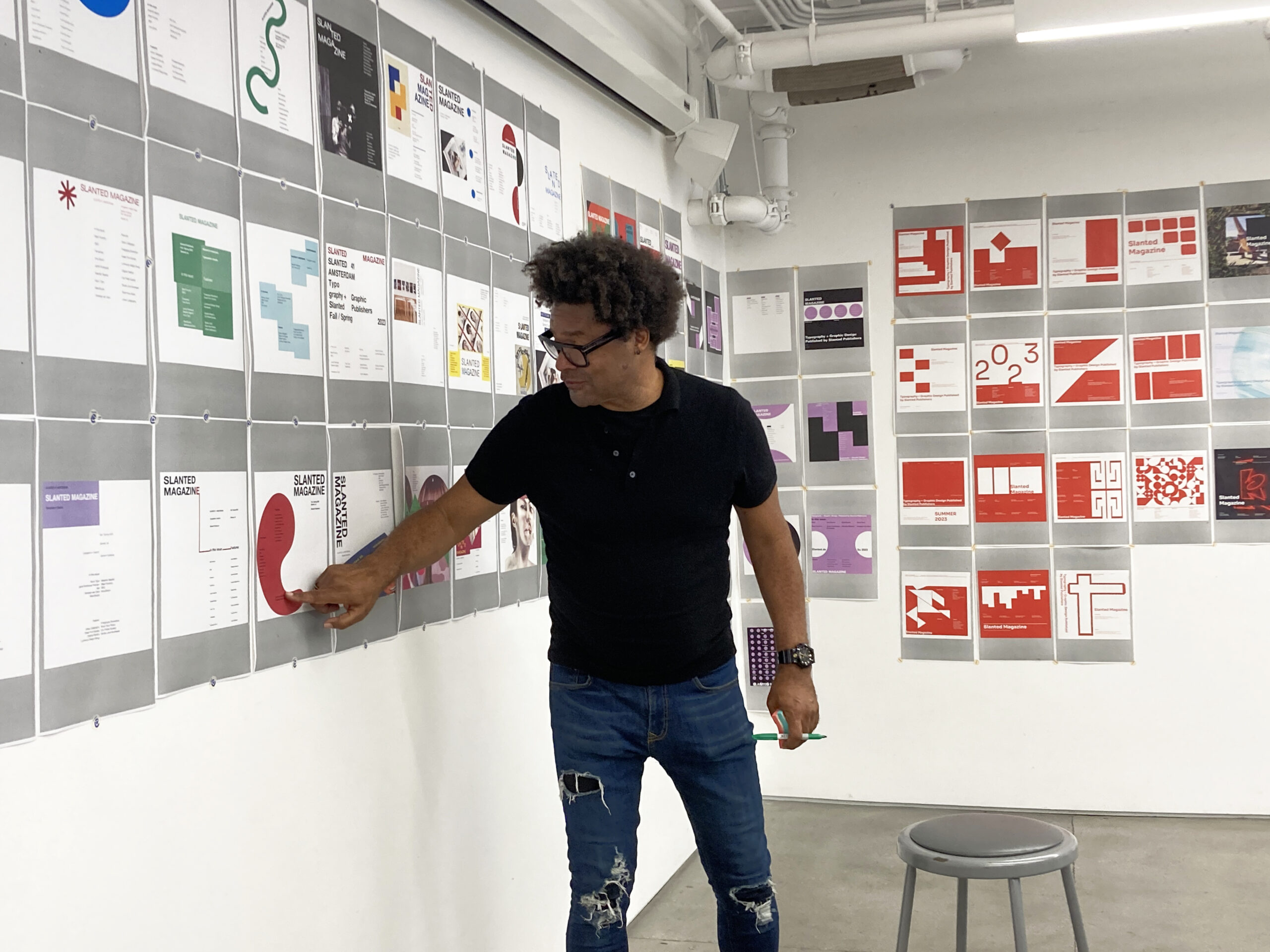
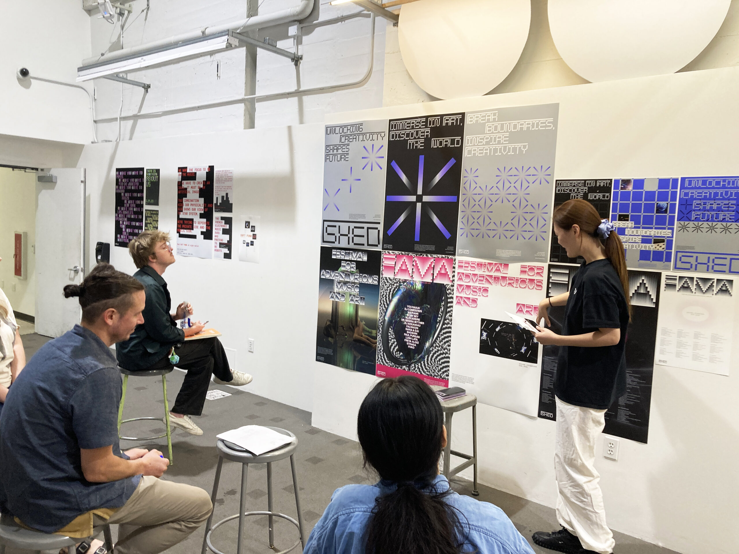
Type 5 Transmedia: Here, the students were working on larger campaigns, which would eventually move into more spatial iterations and some exhibition design. This time the content was chosen by the students. In week nine of the semester the students were working on multiple large-scale poster campaigns, which, when displayed on the white walls of the basement classroom in HMCT, were spectacular.
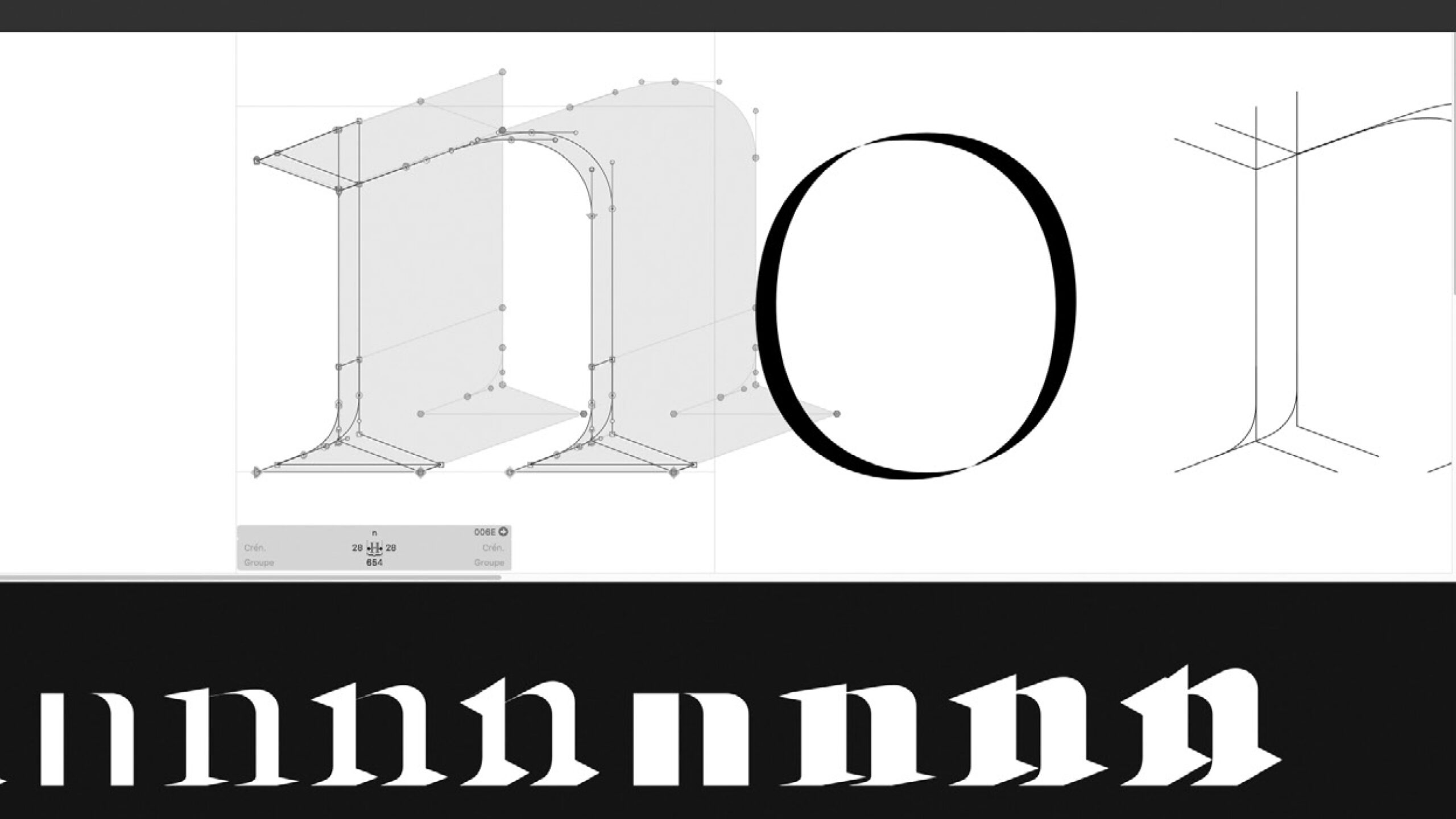
Font Design: Looking at font design and critiquing the details is extremely challenging, especially in a classroom situation. I was incredibly impressed by Greg Lindy’s focus and attention to detail. Between his knowledge of historical reference and his keen eye for detail, he gave each student a very thorough and robust critique.
Advanced Print Studio 7: There were some graduate students in Stephen Serrato’s Advanced Print Studio 7 class, and it was great to have that additional perspective in the classroom. Stephen’s extensive background designing systems from print to web and beyond enabled him to facilitate generative conversations about each student’s work and to highlight opportunities for greater success and impact.
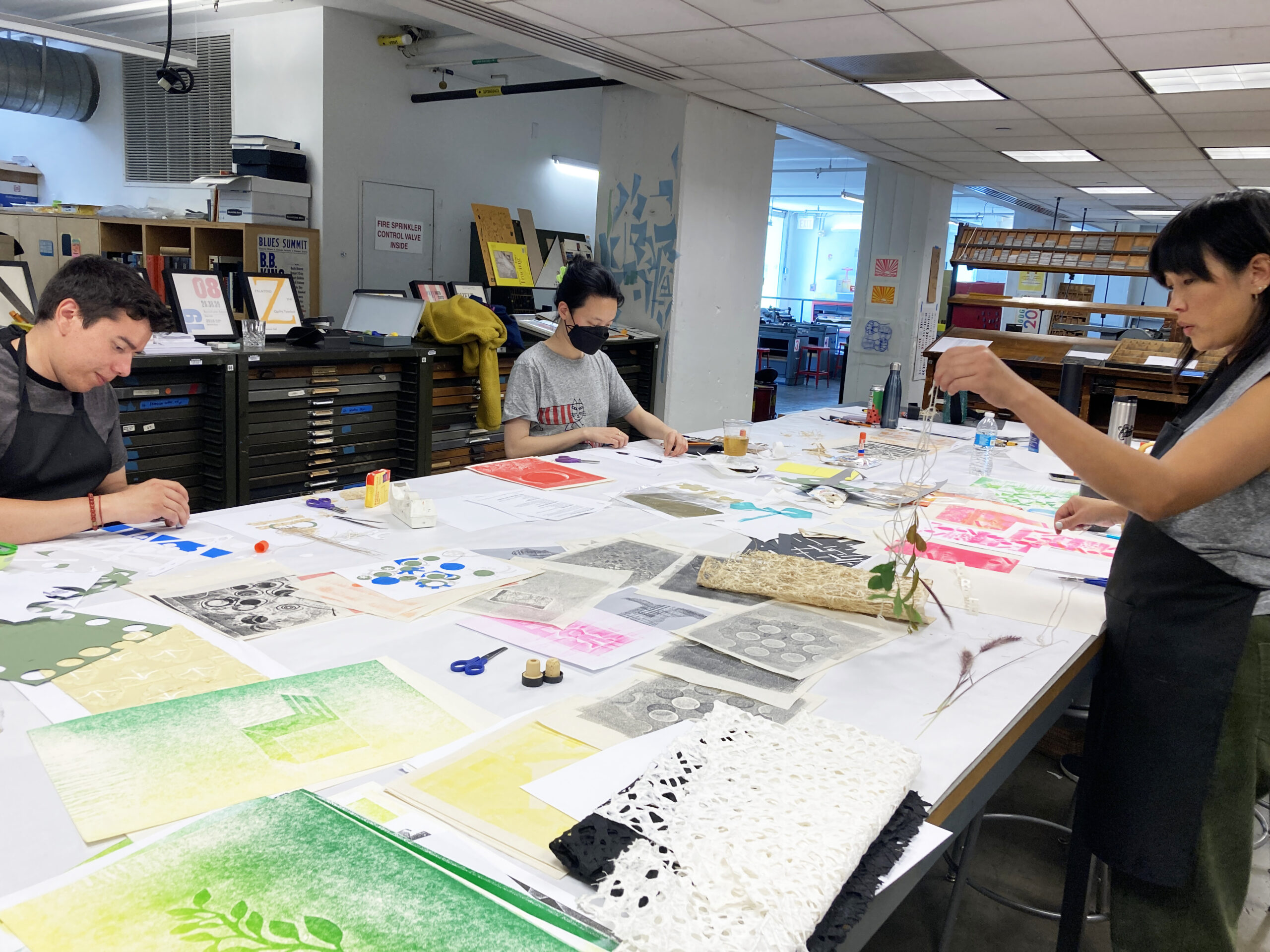
Archetype Press: The day that I visited Joshue Molina’s class in Archetype Press, the students were showing their sketches for a poster response to an issue or event on the topic of diversity and inclusion. Almost everyone in the classroom had a unique and personal perspective to bring to the brief, and the conversation around how best to visually articulate their concepts and move from sketch and concept to print was fascinating. I’m only sorry not to have been there to see the students take their projects to press.
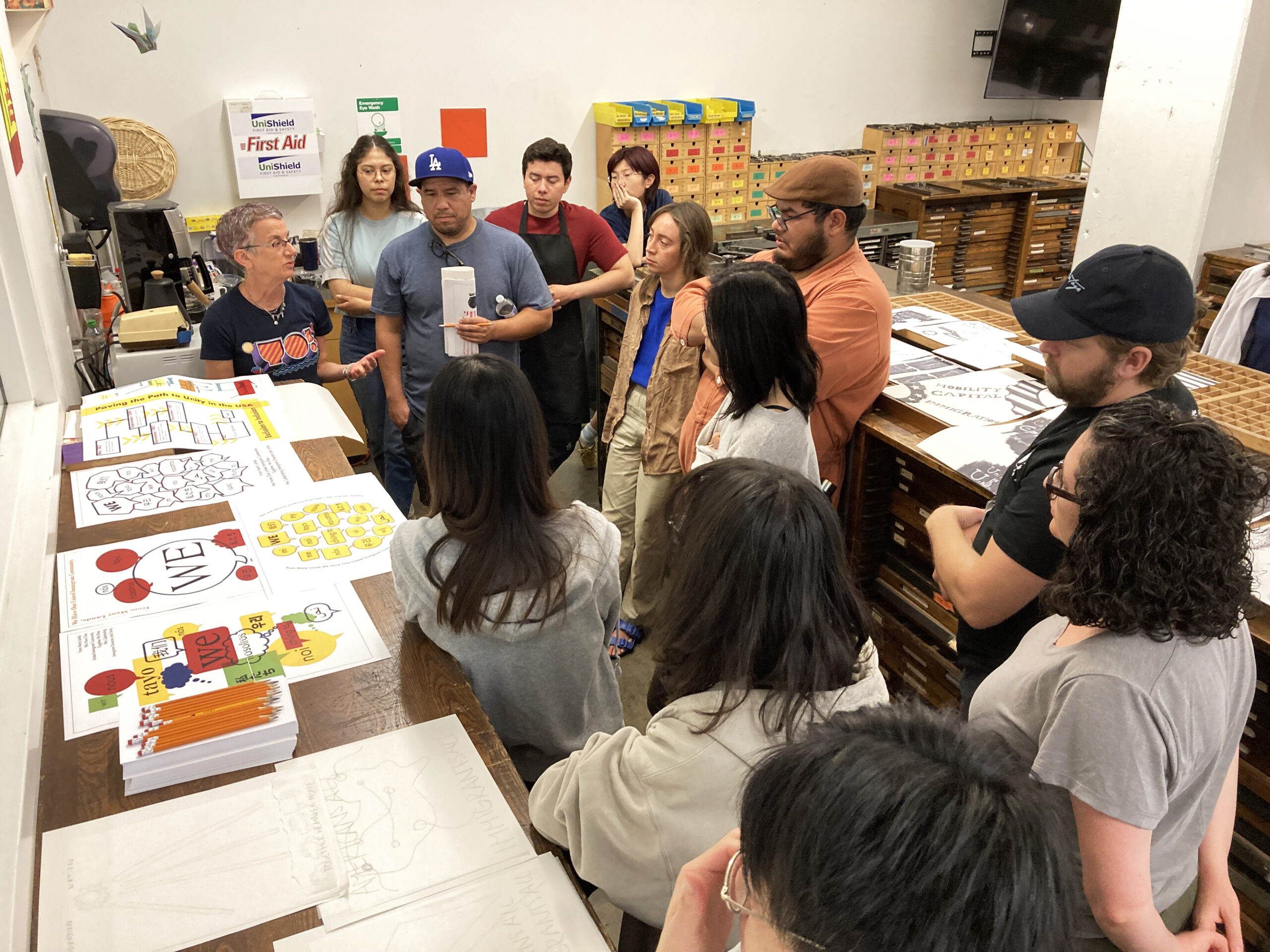
Throughout my classroom observations, it became clear to me that the programs at Art Center have a strong commitment to craft. Craft as a key part of the design process that emphasizes skill and expertise in both analog and digital making. Having the addition of a letterpress studio on site is the perfect way to learn not only about the history of print production and typeface design, but also about the value and importance of craft. Archetype Press is a world-class facility, and the students are very lucky to have it.
Visiting another institution is inspiring. One thing that made a profound impression on me was that even after extensive critiques, each student was given the opportunity for one final reflection or question. This is something that I will take back to my classes and incorporate into my critiques. This one last addition to the critique stuck with me, it happened consistently in all the classes and critiques. It felt like one more way for the students to invest in their own process and find a deeper commitment to their work.
My week at Art Center and HMCT was a remarkable learning experience—time well spent in an amazing design community with generous facilities, experienced and knowledgeable faculty, and a comprehensive design and typography curriculum that is based in foundational principles and fully engaged with contemporary concepts and practices. I made a series of letterpress prints, saw some amazing and inspiring work in the classrooms and archives, and left with many new ideas and a more informed and deeper commitment to typography education to bring back to my classroom.
As an educator, I am keenly aware that having another educator in the classroom can be a potentially stressful experience. I am extremely grateful to all the faculty and students who welcomed me into their classrooms. During my Fellowship week I had the opportunity to attend a variety of classes, from digital to analog and in between, including:
Type1: Foundation, taught by Matthew Sahlit
Type 2: Structure, taught by Ty Drake
Type 5: Transmedia, taught by Geoff Brewerton
Advanced Print Studio 7, taught by Stephen Serrato
Font Design, taught by Greg Lindy
Archetype Press class, taught by Joshue Molina
New Wave Workshop at Archetype Press, taught by Janet Kupchick.
Huge thanks to all of the faculty for their generosity, and to Gloria Kondrup, Joshue Molina, Ximena Amaya, Lavinia Lascaris, Susan Malmstrom, Clifford Pun, and HMCT for making the Fellowship week possible.