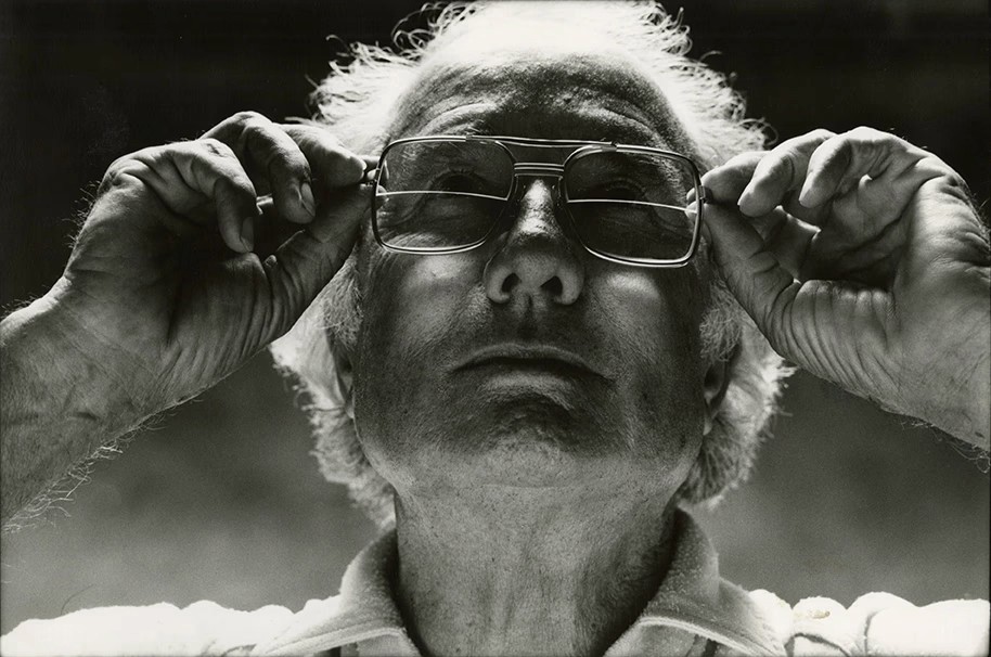
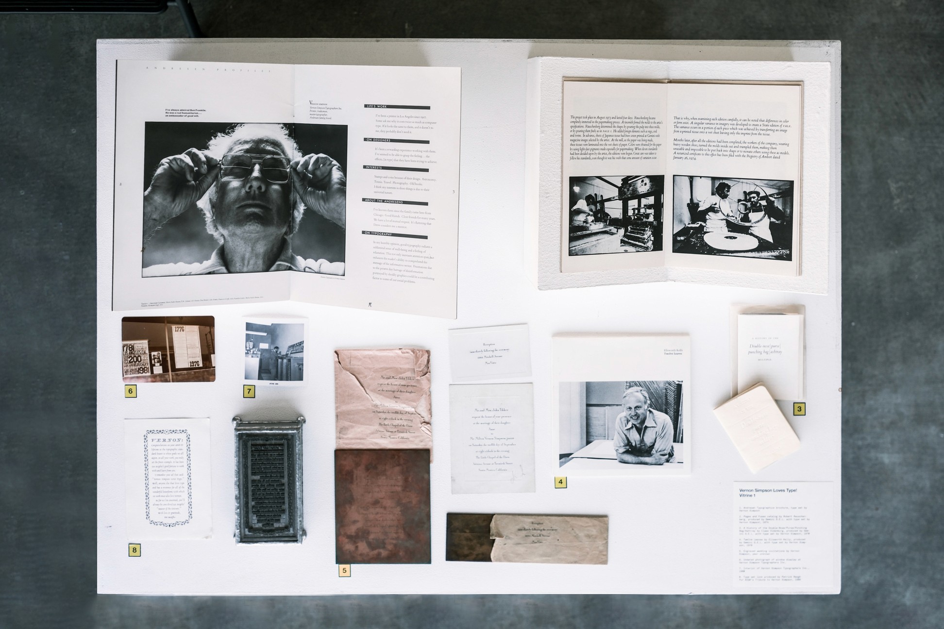
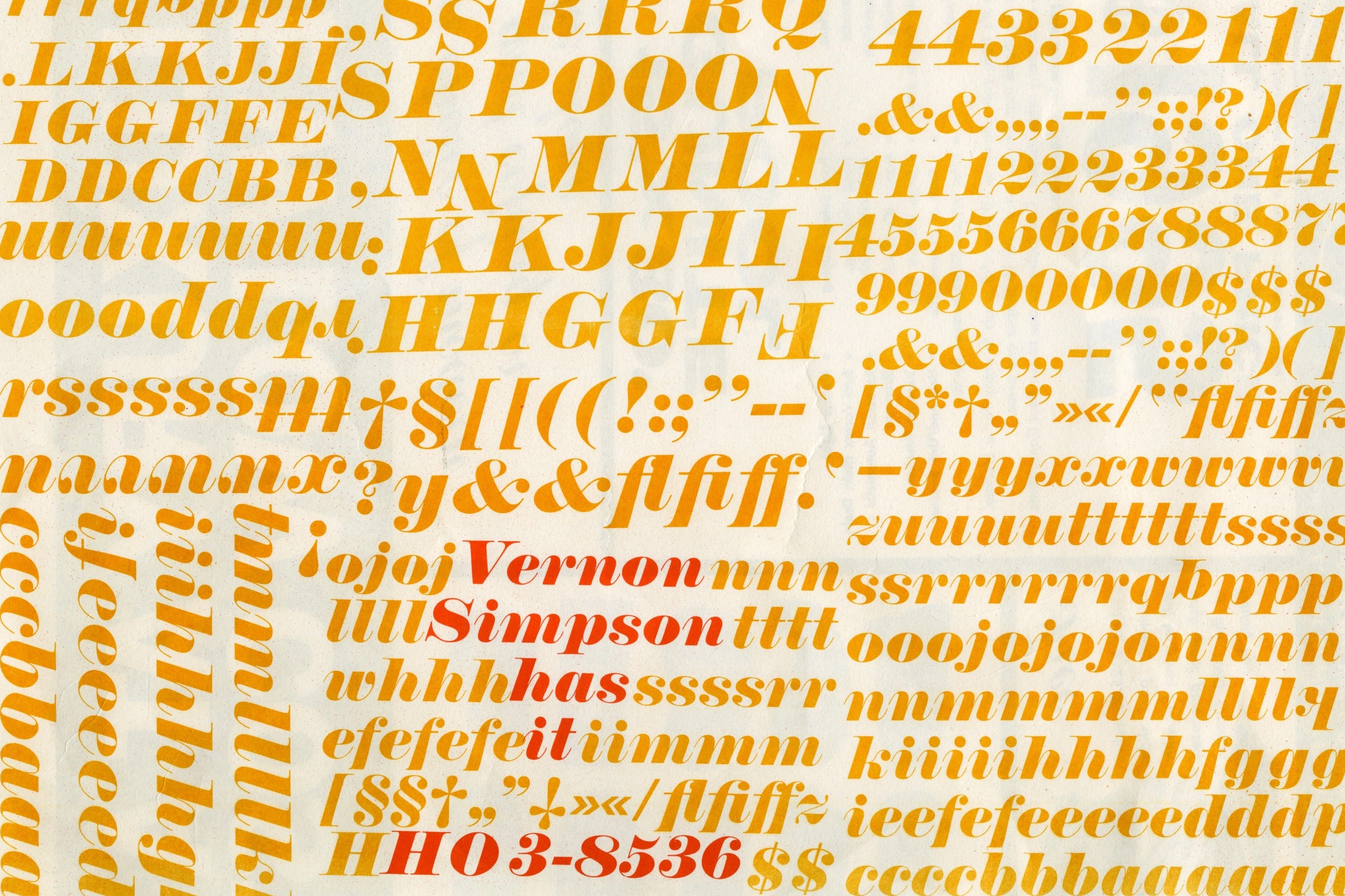
VERNON SIMPSON loves type! This message was in the shopfront window of Vernon Simpson Typographers Inc. next to an open jewelry case displaying, like a diamond ring, a tiny metal lowercase a. Vernon Simpson, whose typography career began in the 1930s and lasted until the late 1980s, was the source of over 2,500 cases of the type collection currently in use at ArtCenter College’s Archetype Press, as well as four Vandercook presses and all of a collection of tabletop presses. | Upon his retirement in 1986, five ArtCenter donors purchased his collection of wood and foundry type, one of the largest collections in the country, for $50,000. The acquisition made possible the establishment of Archetype Press in 1989. Originally located in the Crown City Mattress Works building in Old Town Pasadena (currently an event venue for rent in the Mills Place Shopping Alley), Archetype eventually migrated to ArtCenter's South Campus 950 Building, where students and teachers now use the type and presses. |
 | 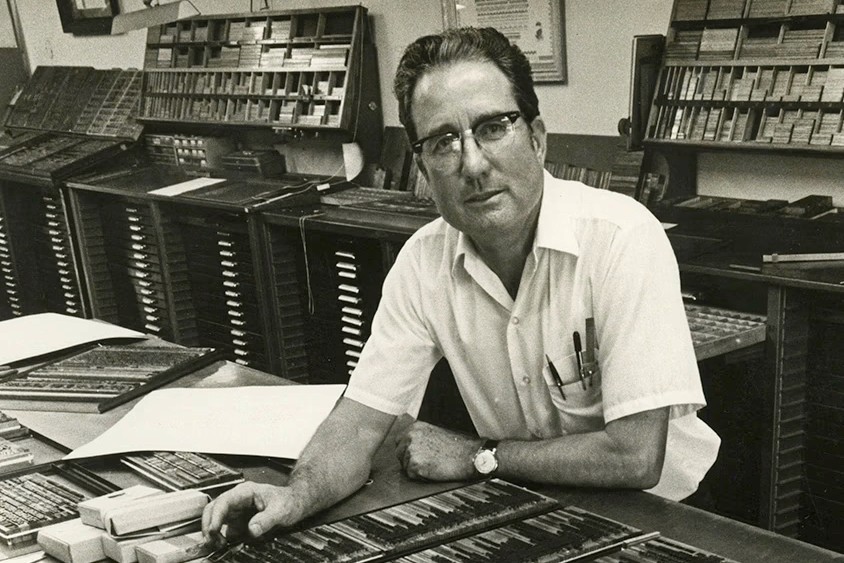 Vernon Simpson in his studio, date/photograher unknown |
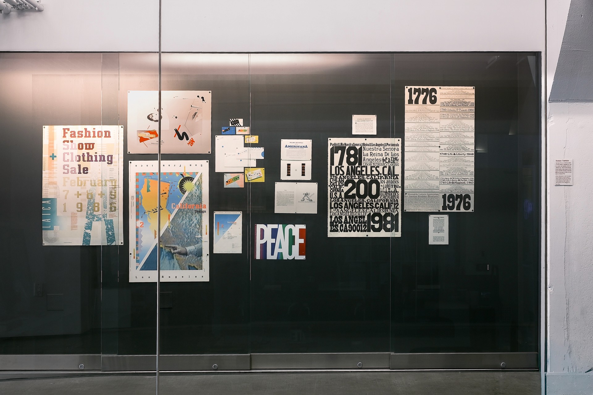
Gemini G.E.L., the famous fine art publishing house, hired Vernon to set type for books, catalogs, and exhibition invitations by Ellsworth Kelly, Robert Rauschenberg, Claes Oldenburg, and William Crutchfield, the latter three of whom were involved in LACMA’s notorious 1970s Art and Technology program. Rauschenberg’s Pages and Fuses, Kelly’s Twelve Leaves, Crutchfield’s Americana exhibition, and Oldenburg’s Notes and A History of the Double-Nose/Purse/Punching Bag/Ashtray were all handset by Vernon. | Vernon perhaps worked most extensively with April Greiman, who embraced the Macintosh in the 1980s. She used computers to create vividly destabilizing, pixelated graphic works that were shot through with dayglo orange and strange diagonals. Her large works are mesmerizing and her small works too; she somehow makes business cards visually fascinating. One of her own, which Vernon supplied the type for, is 12 inches long. Even as his type was cut and pasted to the saturated computer world of April Greiman’s California Design poster, Vernon remained entirely analog. |
Handsetting type is a painstaking and expensive process. The type is leaden and prickly and leaves your hands with a soft, dusty feeling. Opening a type drawer is tricky — these flat wooden beds either get stuck or come out too quickly, and to yank them risks a terrible spill. Still, there is something so attractive about it. George Bernard Shaw, famously particular about the typography of his books, wrote, “I fought linotype and monotype for some time because it would not justify as well as handset could be made to do. But at last, as always happens, the machine outdid the hand, and got all the best types on it. I think this is all you want to know.” This is sad and somewhat true. Vernon, however, never wavered in his commitment to handsetting. I worked at my university’s letterpress studio this year as a monitor, helping the rare student who came down to that dungeon-like room by unlocking a cabinet or something. | It was about ten times smaller than Archetype, which houses a total of eleven Vandercook presses, a Chandler and Price platen press, three tabletop platen presses, and many, many drawers of type. Both rooms have the same smell of oil-based ink and solvents. My studio used soybean oil; Archetype uses Crisco! Students work with machines that are older than most of us, using type that gets worn down. The lifespan of a letter is 1,000 runs, I am told. The majority of the type at Archetype is extremely old and once belonged to Vernon Simpson, who may have clutched these pieces with metal tweezers and used them for an ad for Centinella Drug in 1927. The letters have impressed paper and other surfaces with significations that you can never know because when you peer into their drawers all they do is glint aaaaaaaabbbbcccccc. |
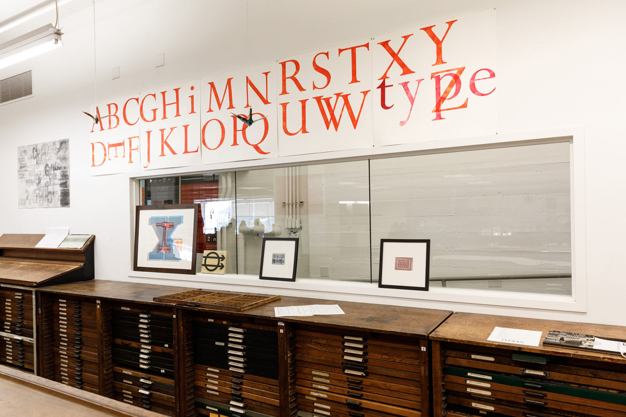
Archetype Press at ArtCenter College
I am fond of the way Frederic Warde, who created the font Arrighi, explained typography in 1928: “There are no principles; there are only the units themselves, small and willing, amazingly able to take on new appearances upside-down or back-to-back yet always retaining that subtle relation to the printed surface that makes them so valuable.” Vernon Simpson understood this… he loved type! —Rosemary Brantley, Visual Art Major, Brown University and Getty Marrow Intern at HMCT, 2026 | Vernon Simpson Loves Type! is on display at HMCT through 2026. We wish to thank the following for their contributions to this project: April Greiman, Patrick Reagh, John Coy, Louise Sandhaus, Tracey Shiffman, Gloria Kondrup, Suzanne Gelson and Gemini G.E.L., Cheri Gray, Ron Romero, Carrie Hansen, Jim Cross, and the Getty Marrow Internship program. Special thanks to HMCT Archive Assistant Vini Marques for his assistance. |