It is always a pleasure to discover great work by a designer unknown to me. I recently acquired some books designed by Christian Chruxin, who was a graphic designer working in Berlin in the 1960s and later. They are classics of a particular kind of Mittel-European modernist typography that bring joy to the eyes of this type and language addict trained in England and Basel.
These small (14 x 16 cm, 36 pages) letterpress-printed books were part of a series of artistic, poetic, and literary texts begun in 1959 by the Berlin publishing house Wolfgang Fietkau Verlag. We are discussing here numbers 8 (acht), 10 (zehn), and 12 (zwölf) of the series, published from 1964–66. I can think of at least three good reasons why these pieces are significant and worthy of discussion.
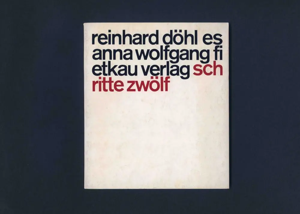
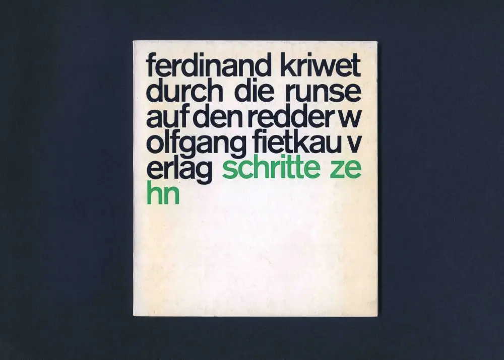
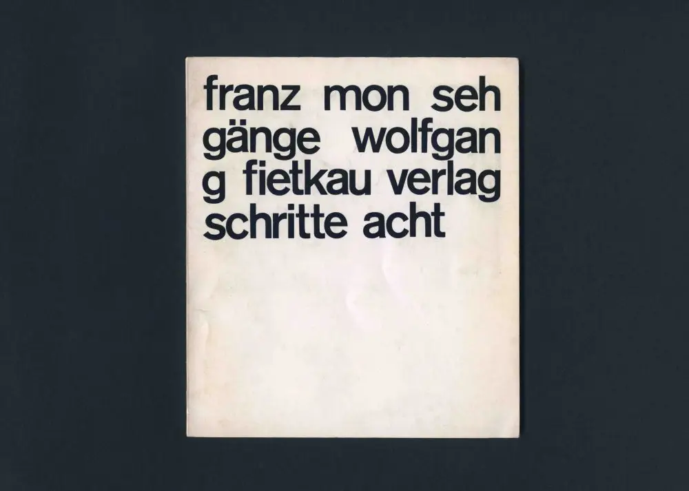
Firstly, they represent a high-tide mark of a certain kind of reductivist/rationalist approach to typographic design: one size one weight all lower case akzidenz grotesk medium start in the top left corner go to the edge of the page don’t worry about breaking words don’t worry about hyphenation no punctuation keep going until the text runs out and add color to separate the volume number with the remaining white space of the page to add asymmetrical balance. A simple premise perhaps, but one that yields breathtaking results from the clarity of purpose. It is a prime early example of what I refer to as a system aesthetic, whereby the design parameters are established beforehand, and then the information/material is entered, consistently generating different but interesting results each time. There were at least thirty in the series.
It is worth reminding ourselves that all lower case is seen today as a style choice, lending perhaps an undertone of friendly informality. But we must remember that in German, nouns are always capitalized, as well as the conventional initial letter and proper names, so to use all lower case is not only a style choice but also a radical rejection of orthographic norms, with a hint of counter-culture rebelliousness. Not forgetting that it just looks good—the unified set of characters giving the structure provided by the x-height, activated by ascenders and descenders, but without the hierarchical imperative/visual noise of capital letters. Obviously, Chruxin was not the first to make this move, but his use of this approach displays allegiance to a certain point of view.
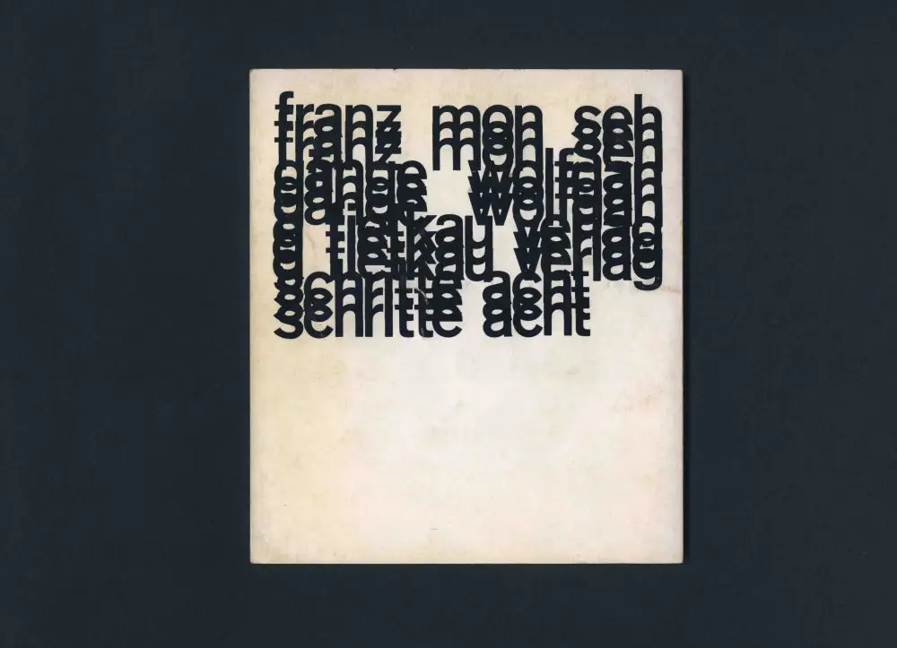
Secondly, these are great advertisements for the distinct advantages of the rigors, discipline, and restrictions of working in letterpress, and I don’t mean that with any sense of nostalgia attached. Letterpress may have been a necessity at the time, but Chruxin’s designs for this series show what is possible when a designer responds to and works sympathetically with the system at hand. But the designs are more than that, as the keener eyes amongst you will have noticed that issues zehn and zwölf (with the colored type) have tighter leading (baseline to baseline measurement) than issue acht (all black). In fact, the leading is impossibly tight for letterpress, literally impossible with physical blocks of metal which can only be set solid, physically touching (36 point on 36 point for example). What we see here is called negative leading. This suggests that the black type of lines one, three, and five of the Ferdinand Kriwet cover were printed in a first pass, with lines two and four overprinted afterwards, followed by the green type on lines five and six. This allows for the very tight relationship of ascenders to baselines, aided by the fortuitous/planned avoidance of ascenders to descenders.
Thirdly, following on from that last point, this impossibly tight leading on the covers presages the tight or negative leading that would soon be possible with the advent of the phototypesetting systems that were becoming available. Tight leading and, more particularly, tight tracking/letterspacing would be seen in phototypesetting in advertising headlines and magazines such as Twen and Avant Garde. It is interesting to note how often the work produced at the end of one technological phase, as we see here, anticipates the possibilities inherent in the technology that follows it. Another example would be how the type and film composite collages of Weingart’s posters of the late 1970s/early 80s anticipated the layers that were shortly thereafter easily possible in Photoshop on the new desktop computer systems that came in the mid 1980s.
In design history books, what look like style decisions chosen by the designer are often in fact responses to new technologies. A case in point is the work of David Carson, whose designs for Beach Culture magazine are typically lauded for their experimental/surf attitude but equally, more fully express designer-playing-with-new-toy (typesetting). The then-recently-available Apple computer typesetting systems meant that the designer was suddenly, liberatingly in charge of the once-inaccessible typesetting process (at least for the first time since letterpress printers were simultaneously designers, typesetters, and printers back at the beginning of the twentieth century). A kid with a new toy wants to throw it around and see how it performs. Hence the designer typesetting performance experiments of the early 1990s. History… it’s just one damned thing after another.
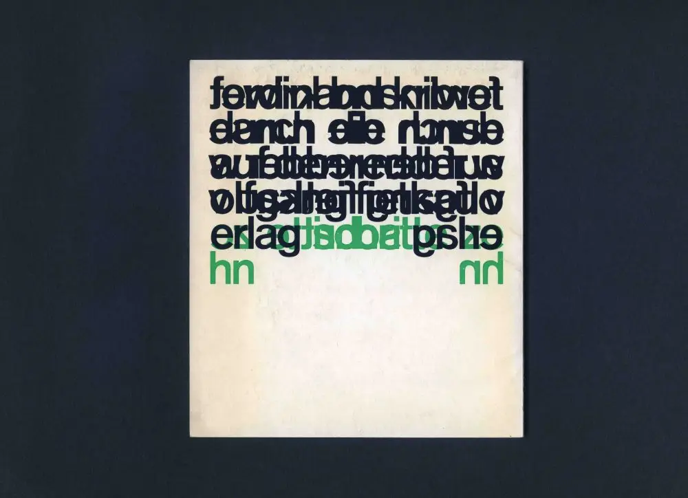
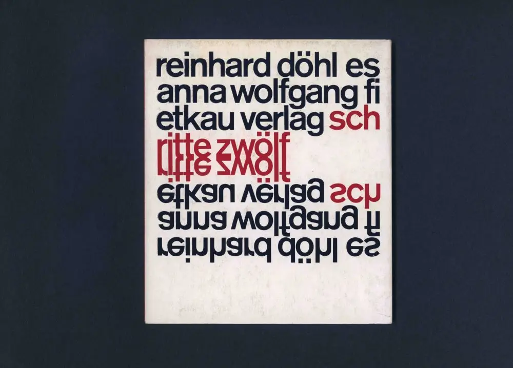
Chruxin’s designs for the back covers in the series are a joy as well, being different permutations of overprinting. But the reversed text confuses me a little, as it suggests some film work and a block made, as it would not have been possible to print that directly with metal type. I then thought perhaps some covers were printed offset, but they are thin card and the impression of the type is visible on the back, so it is a bit of a production mystery, with the use of some kind of photo block being my best guess.
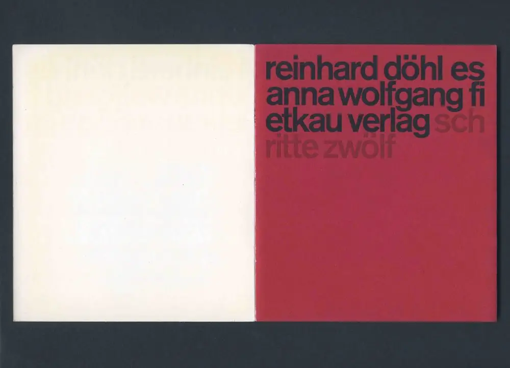
The book interiors are all letterpress set in one size one weight of Akzidenz Grotesk bold, with the colored text on the cover matching the color of the fly leaves, which, in the case of issue no. 8 (acht), meant black on black. Again, what stands out is the rigor of the interiors with tight margins and use of all lower case for the most part.
My thanks go out to Fredrik Averin at The Idea of the Book in Portland for bringing the work of Christian Chruxin to my attention. Check out their site for further esoteric print delicacies. Further research has since brought to my attention an entry on Christian Chruxin in the book Typography: When Who How by Friedrich Friedl / Nicolaus Ott / Bernard Stein published by Könemann in 1998. A book dedicated to his work, Die Teile Der Summe. Begegnungen mit Christian Chruxin, was published in 2008 by Walther König in collaboration with ZKM in Karlsruhe. Chruxin died in 2006, but you can find out more at www.chruxin.de.
—Simon Johnston, Creative Director, HMCT
Christian Chruxin
It is always a pleasure to discover great work by a designer unknown to me. I recently acquired some books designed by Christian Chruxin, who was a graphic designer working in Berlin in the 1960s and later. They are classics of a particular kind of Mittel-European modernist typography that bring joy to the eyes of this type and language addict trained in England and Basel.
These small (14 x 16 cm, 36 pages) letterpress-printed books were part of a series of artistic, poetic, and literary texts begun in 1959 by the Berlin publishing house Wolfgang Fietkau Verlag. We are discussing here numbers 8 (acht), 10 (zehn), and 12 (zwölf) of the series, published from 1964–66. I can think of at least three good reasons why these pieces are significant and worthy of discussion.
Firstly, they represent a high-tide mark of a certain kind of reductivist/rationalist approach to typographic design: one size one weight all lower case akzidenz grotesk medium start in the top left corner go to the edge of the page don’t worry about breaking words don’t worry about hyphenation no punctuation keep going until the text runs out and add color to separate the volume number with the remaining white space of the page to add asymmetrical balance. A simple premise perhaps, but one that yields breathtaking results from the clarity of purpose. It is a prime early example of what I refer to as a system aesthetic, whereby the design parameters are established beforehand, and then the information/material is entered, consistently generating different but interesting results each time. There were at least thirty in the series.
It is worth reminding ourselves that all lower case is seen today as a style choice, lending perhaps an undertone of friendly informality. But we must remember that in German, nouns are always capitalized, as well as the conventional initial letter and proper names, so to use all lower case is not only a style choice but also a radical rejection of orthographic norms, with a hint of counter-culture rebelliousness. Not forgetting that it just looks good—the unified set of characters giving the structure provided by the x-height, activated by ascenders and descenders, but without the hierarchical imperative/visual noise of capital letters. Obviously, Chruxin was not the first to make this move, but his use of this approach displays allegiance to a certain point of view.
Secondly, these are great advertisements for the distinct advantages of the rigors, discipline, and restrictions of working in letterpress, and I don’t mean that with any sense of nostalgia attached. Letterpress may have been a necessity at the time, but Chruxin’s designs for this series show what is possible when a designer responds to and works sympathetically with the system at hand. But the designs are more than that, as the keener eyes amongst you will have noticed that issues zehn and zwölf (with the colored type) have tighter leading (baseline to baseline measurement) than issue acht (all black). In fact, the leading is impossibly tight for letterpress, literally impossible with physical blocks of metal which can only be set solid, physically touching (36 point on 36 point for example). What we see here is called negative leading. This suggests that the black type of lines one, three, and five of the Ferdinand Kriwet cover were printed in a first pass, with lines two and four overprinted afterwards, followed by the green type on lines five and six. This allows for the very tight relationship of ascenders to baselines, aided by the fortuitous/planned avoidance of ascenders to descenders.
Thirdly, following on from that last point, this impossibly tight leading on the covers presages the tight or negative leading that would soon be possible with the advent of the phototypesetting systems that were becoming available. Tight leading and, more particularly, tight tracking/letterspacing would be seen in phototypesetting in advertising headlines and magazines such as Twen and Avant Garde. It is interesting to note how often the work produced at the end of one technological phase, as we see here, anticipates the possibilities inherent in the technology that follows it. Another example would be how the type and film composite collages of Weingart’s posters of the late 1970s/early 80s anticipated the layers that were shortly thereafter easily possible in Photoshop on the new desktop computer systems that came in the mid 1980s.
In design history books, what look like style decisions chosen by the designer are often in fact responses to new technologies. A case in point is the work of David Carson, whose designs for Beach Culture magazine are typically lauded for their experimental/surf attitude but equally, more fully express designer-playing-with-new-toy (typesetting). The then-recently-available Apple computer typesetting systems meant that the designer was suddenly, liberatingly in charge of the once-inaccessible typesetting process (at least for the first time since letterpress printers were simultaneously designers, typesetters, and printers back at the beginning of the twentieth century). A kid with a new toy wants to throw it around and see how it performs. Hence the designer typesetting performance experiments of the early 1990s. History… it’s just one damned thing after another.
Chruxin’s designs for the back covers in the series are a joy as well, being different permutations of overprinting. But the reversed text confuses me a little, as it suggests some film work and a block made, as it would not have been possible to print that directly with metal type. I then thought perhaps some covers were printed offset, but they are thin card and the impression of the type is visible on the back, so it is a bit of a production mystery, with the use of some kind of photo block being my best guess.
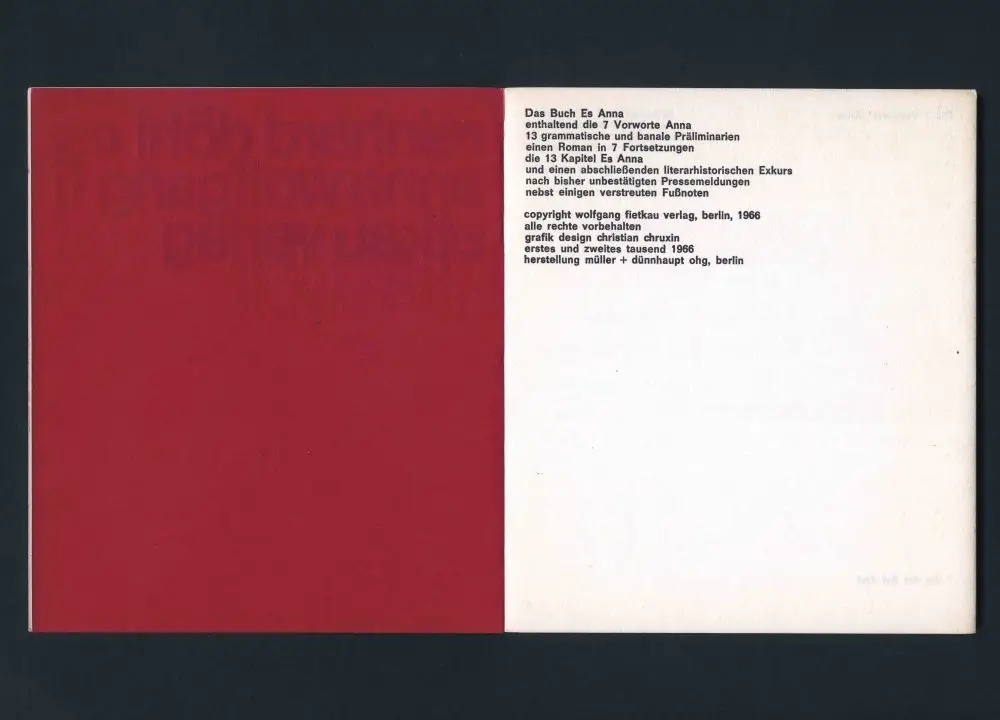
The book interiors are all letterpress set in one size one weight of Akzidenz Grotesk bold, with the colored text on the cover matching the color of the fly leaves, which, in the case of issue no. 8 (acht), meant black on black. Again, what stands out is the rigor of the interiors with tight margins and use of all lower case for the most part.
My thanks go out to Fredrik Averin at The Idea of the Book in Portland for bringing the work of Christian Chruxin to my attention. Check out their site for further esoteric print delicacies. Further research has since brought to my attention an entry on Christian Chruxin in the book Typography: When Who How by Friedrich Friedl / Nicolaus Ott / Bernard Stein published by Könemann in 1998. A book dedicated to his work, Die Teile Der Summe. Begegnungen mit Christian Chruxin, was published in 2008 by Walther König in collaboration with ZKM in Karlsruhe. Chruxin died in 2006, but you can find out more at www.chruxin.de.
—Simon Johnston, Creative Director, HMCT
SUGGESTED ARTICLES
College Book Art Association 2025 National Conference
A Visit to Tipoteca in Italy
The Daily Heller on Quasi