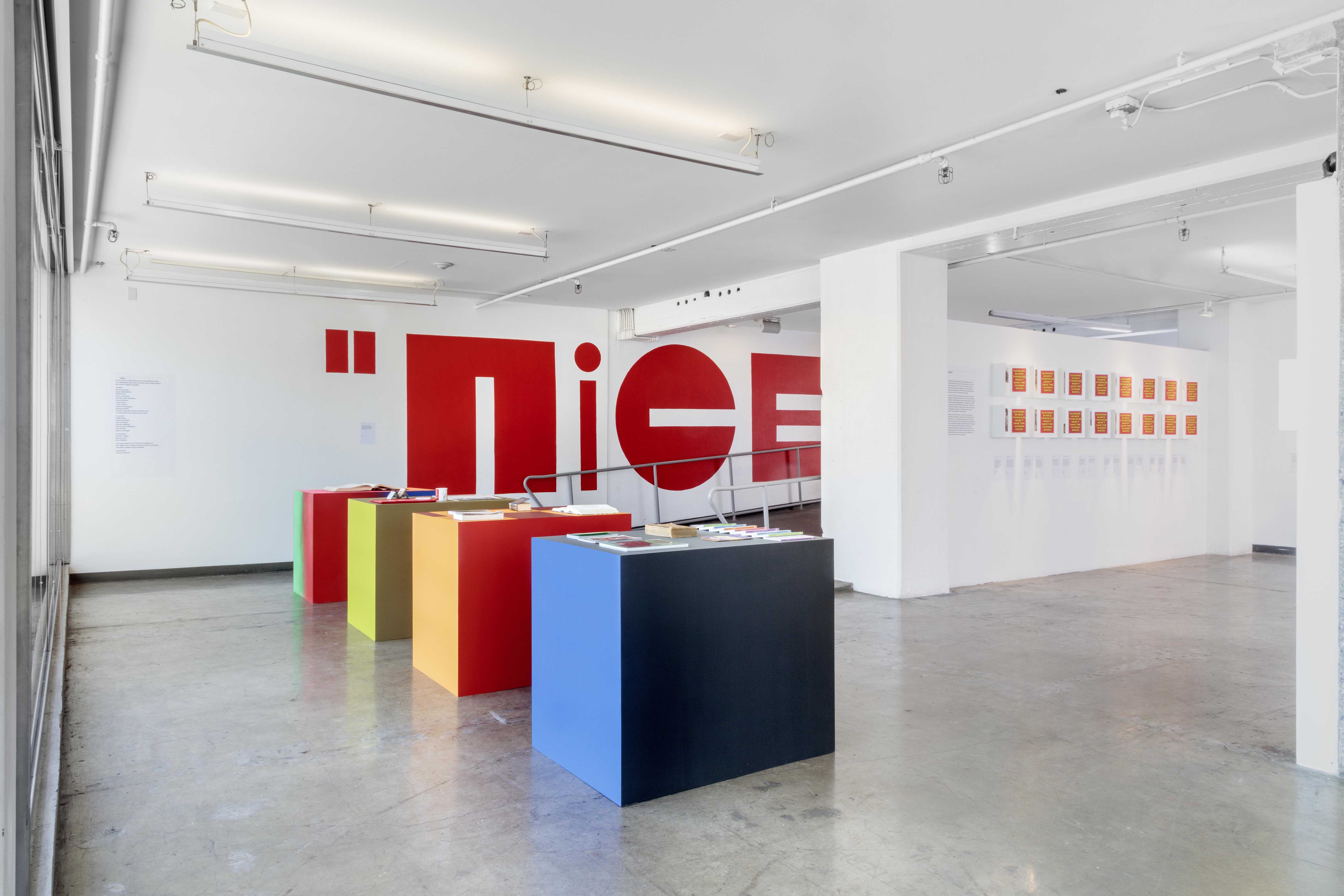
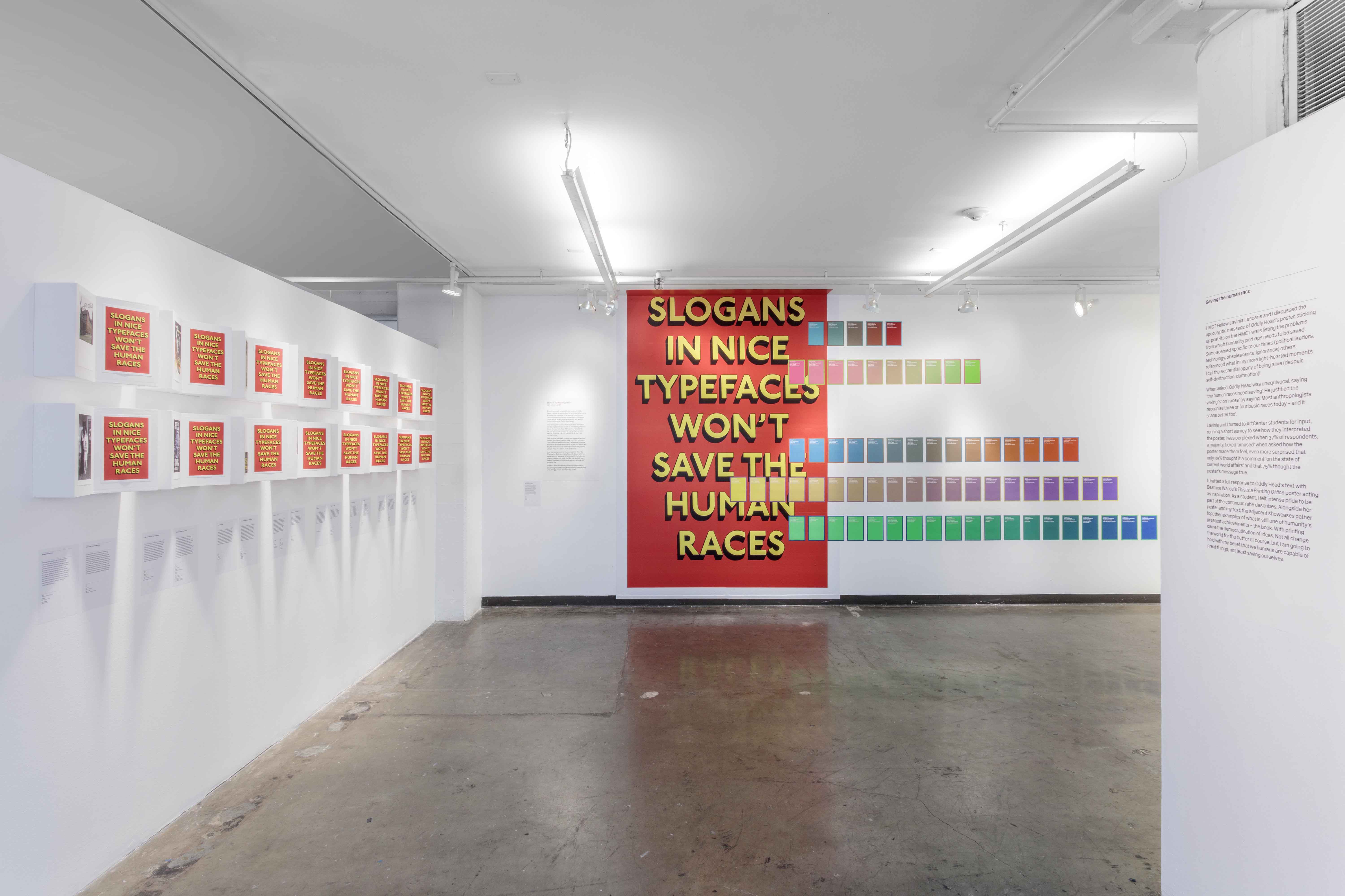
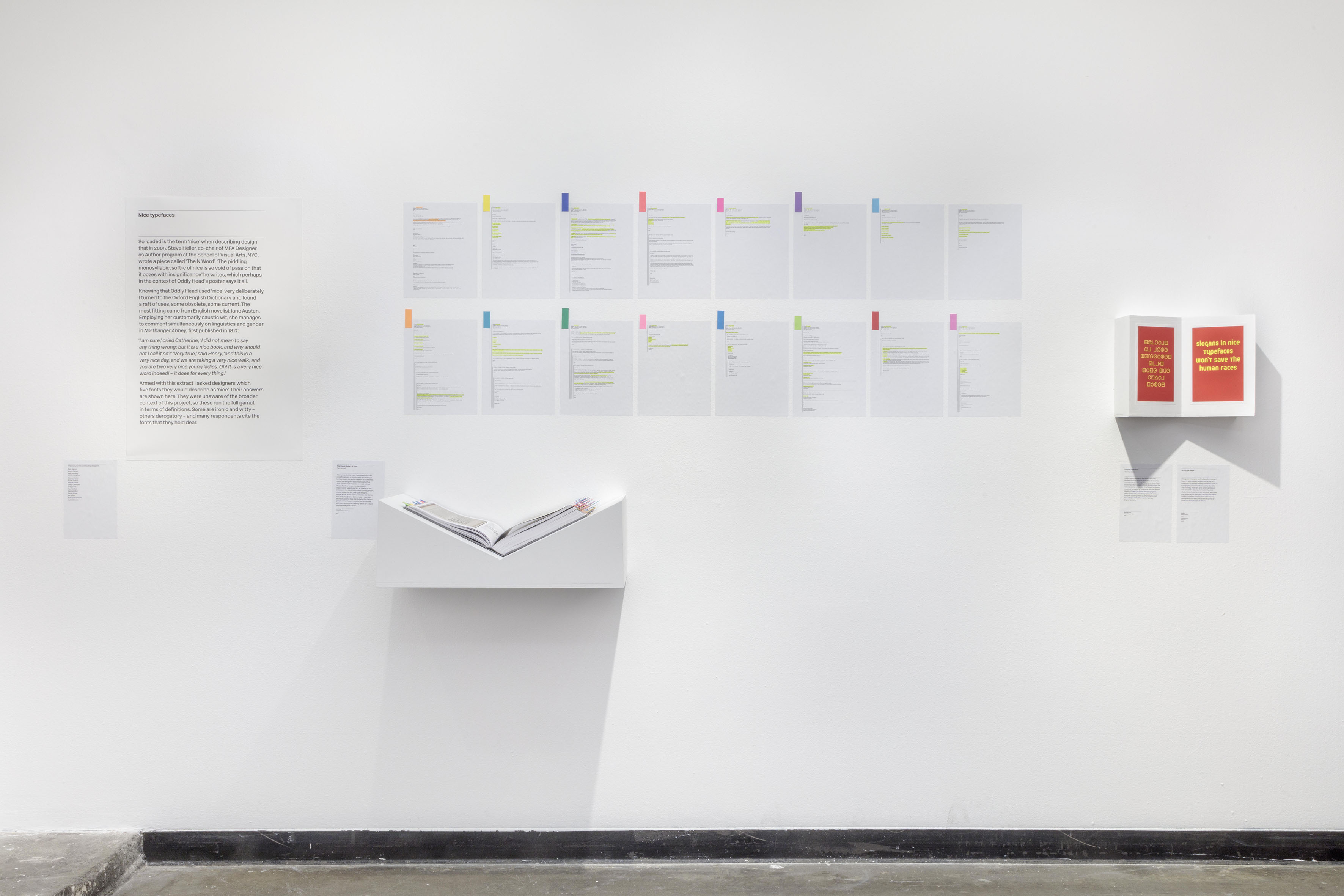
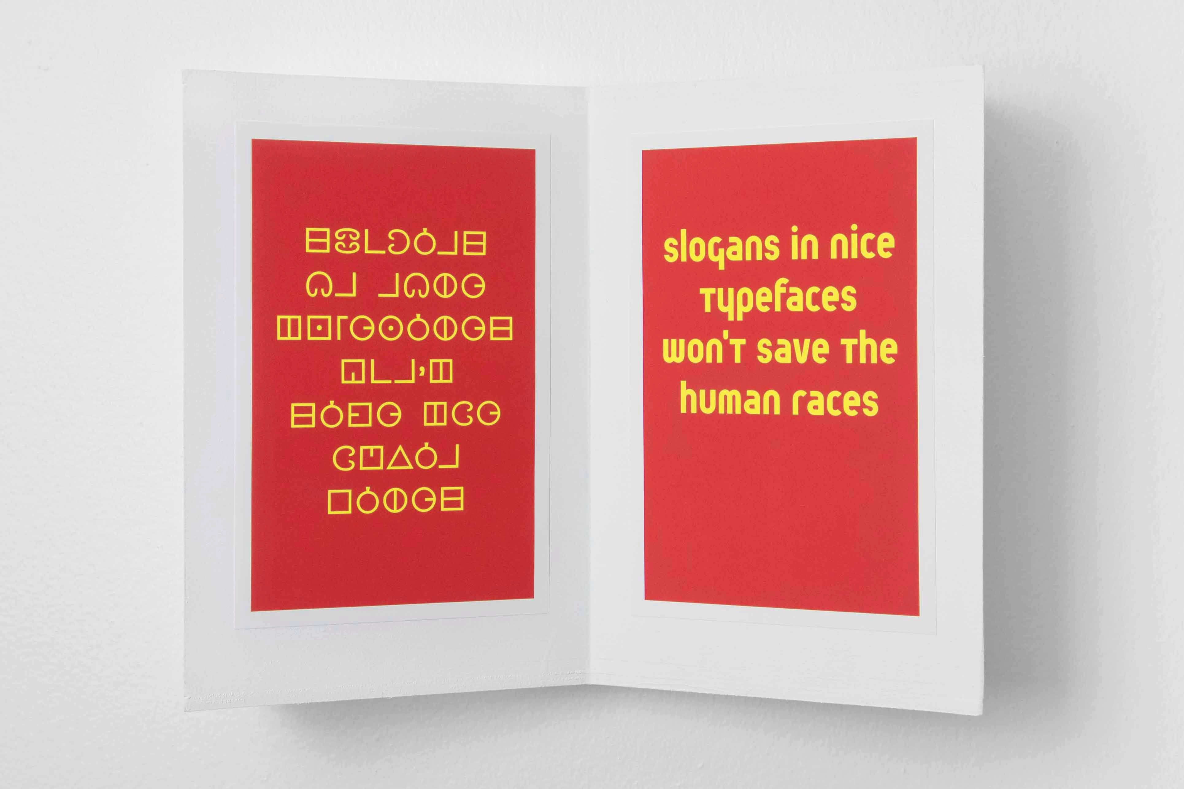
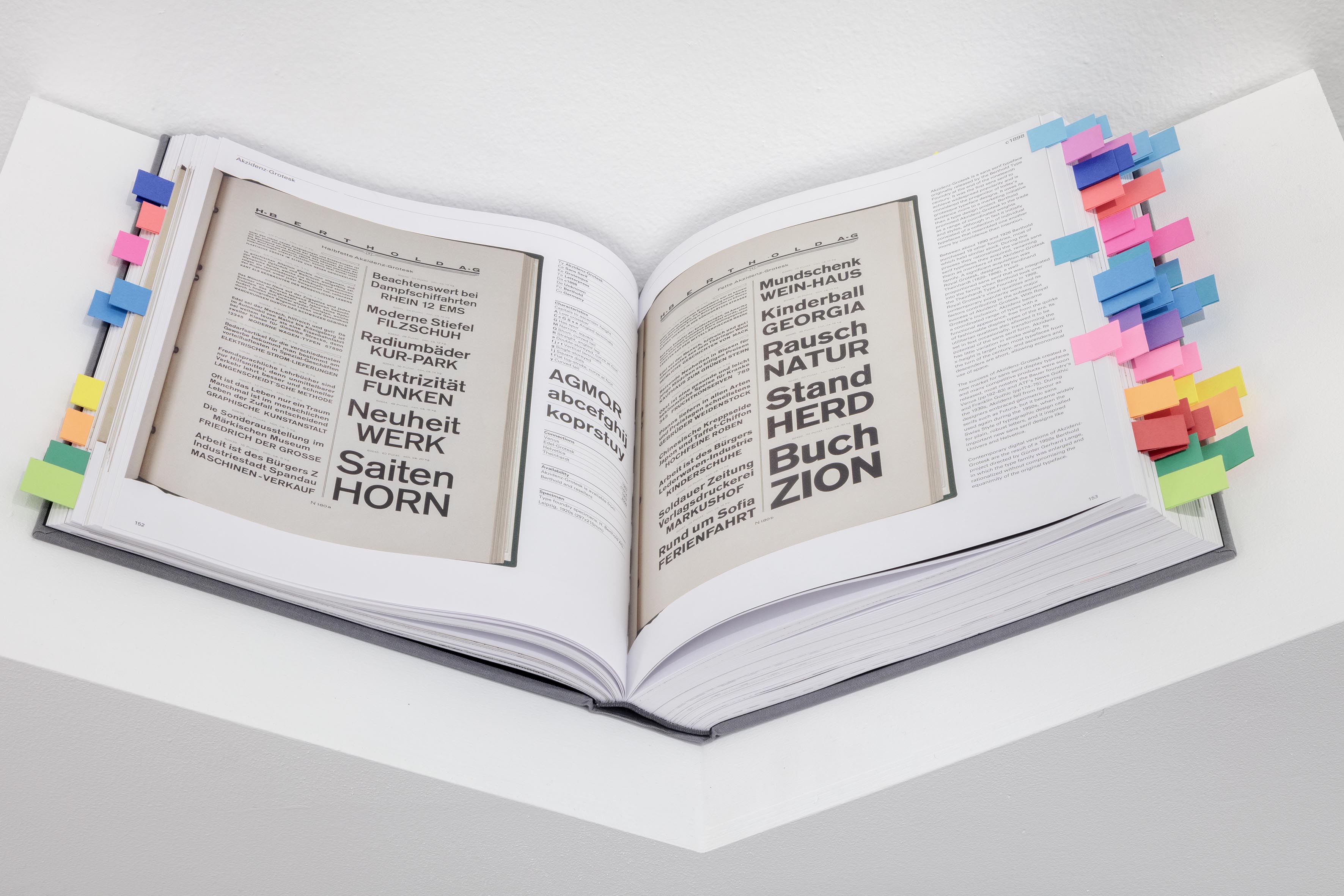
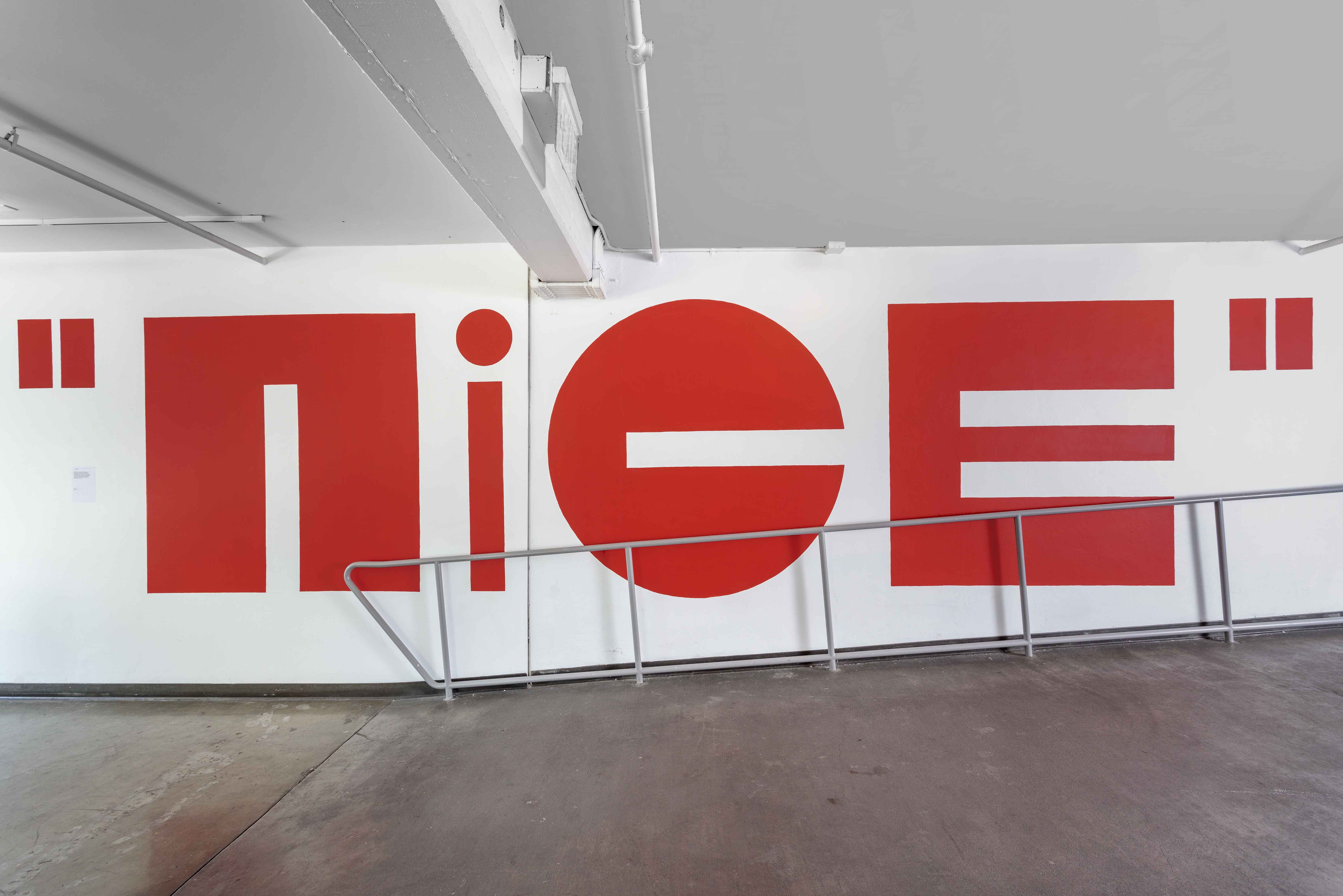
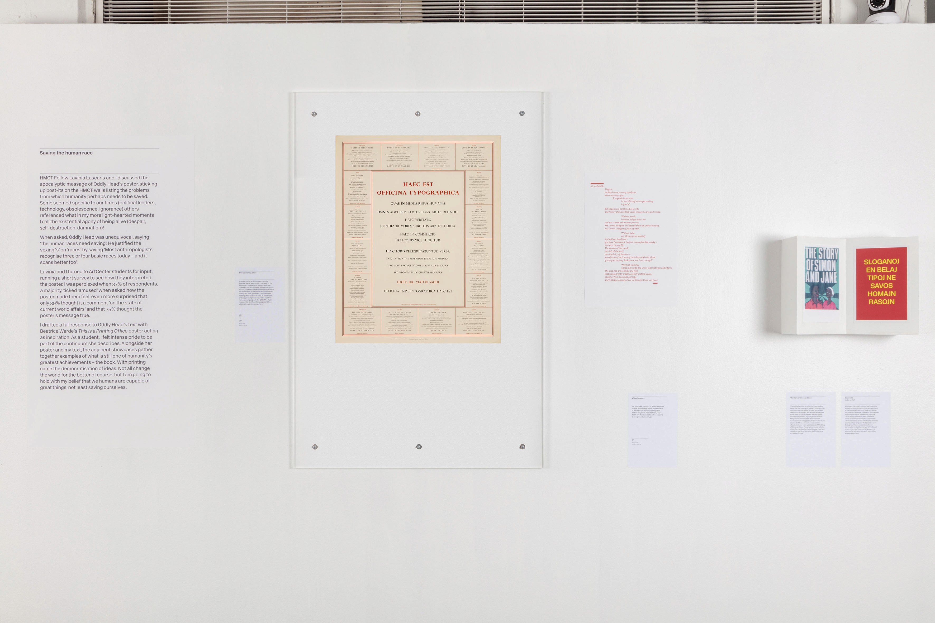
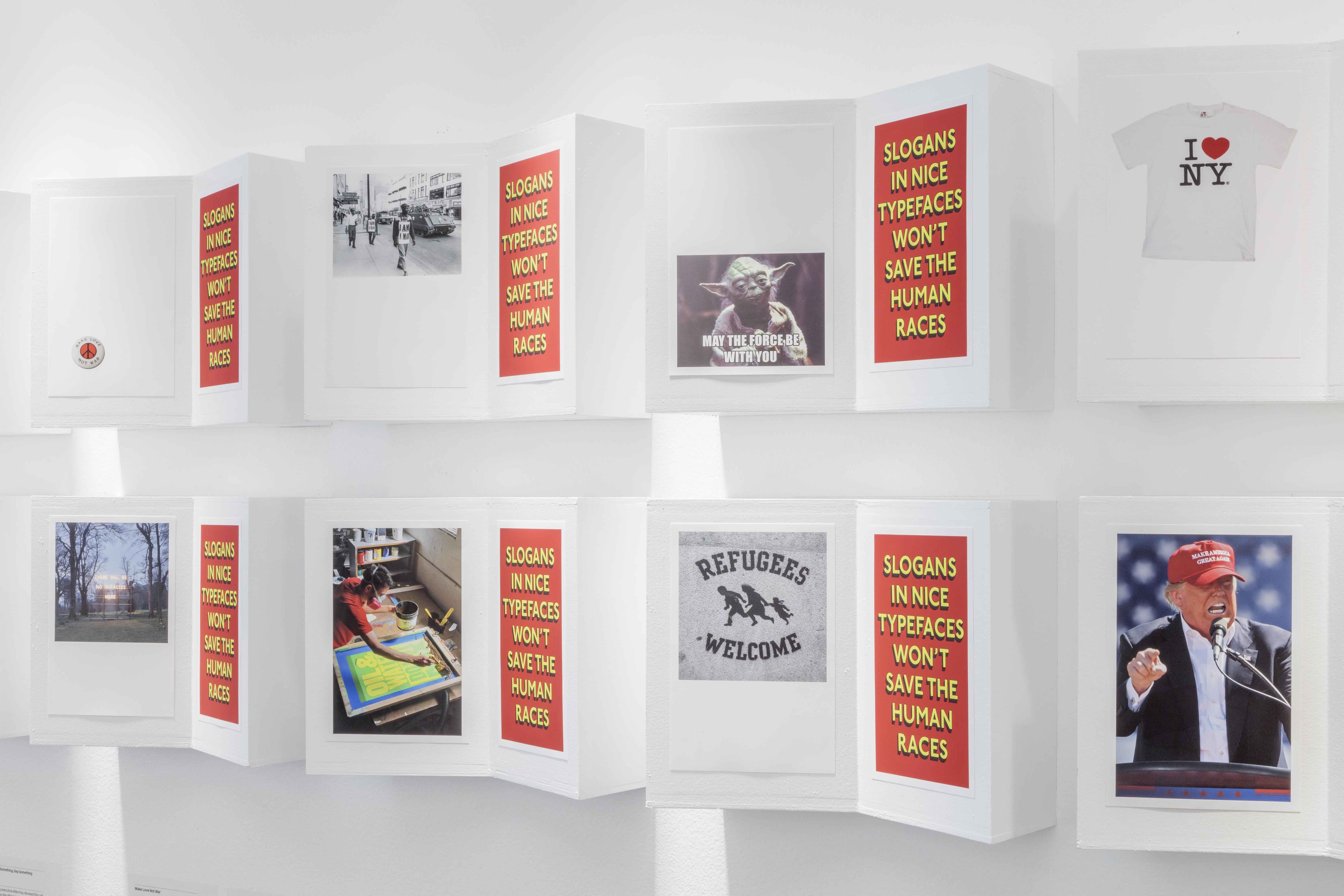
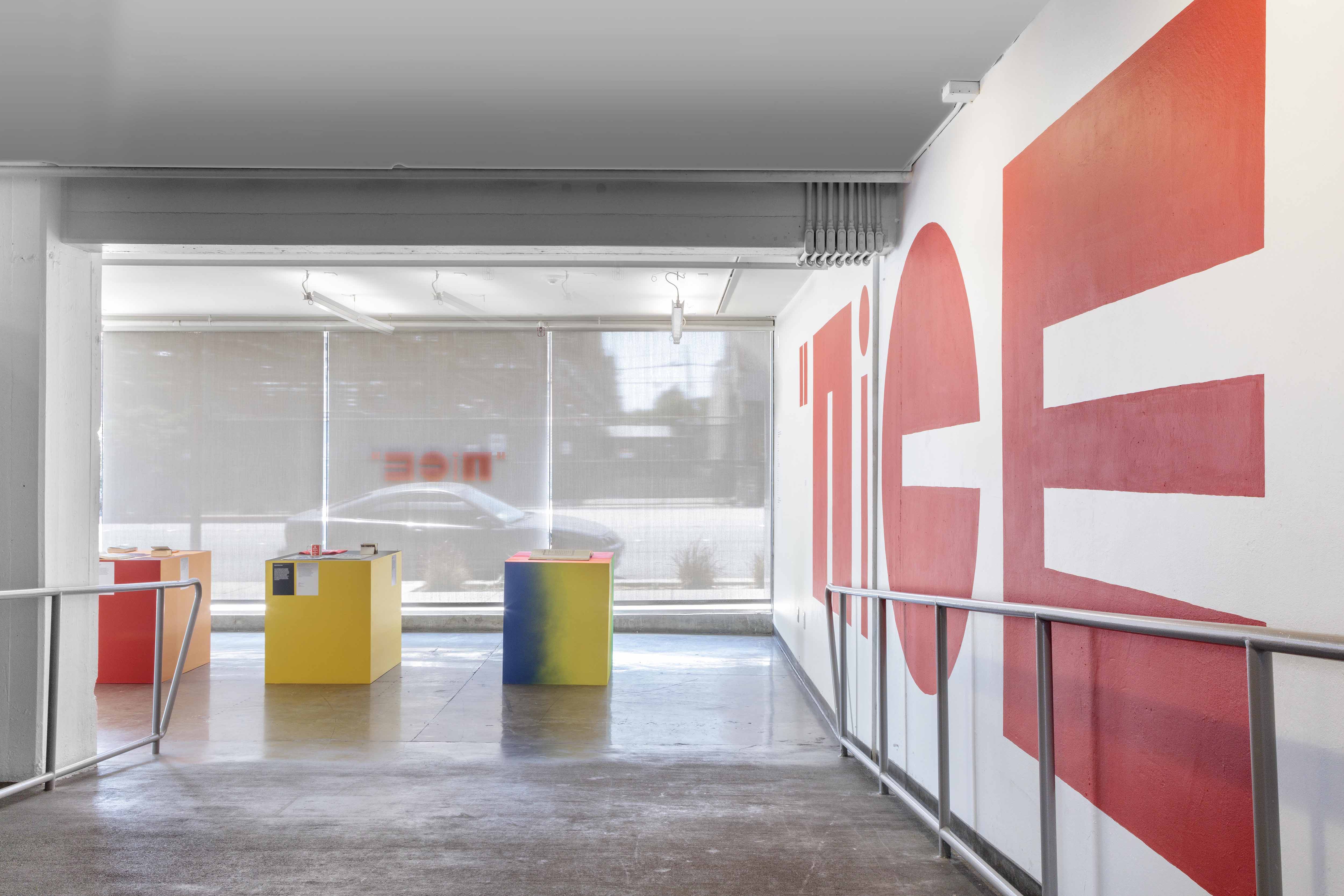
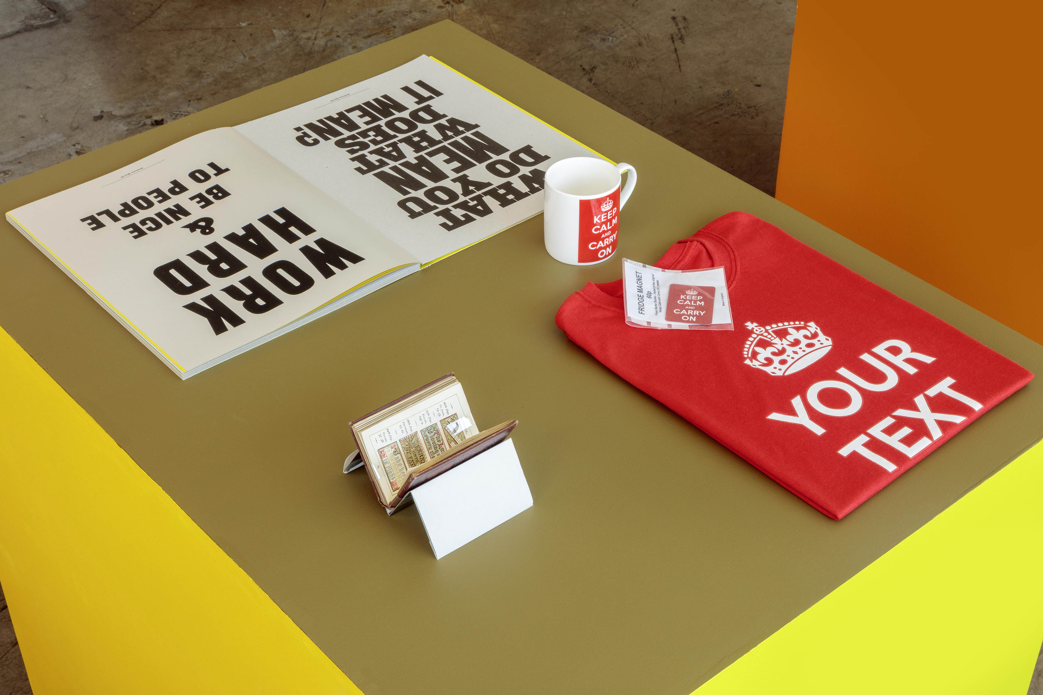
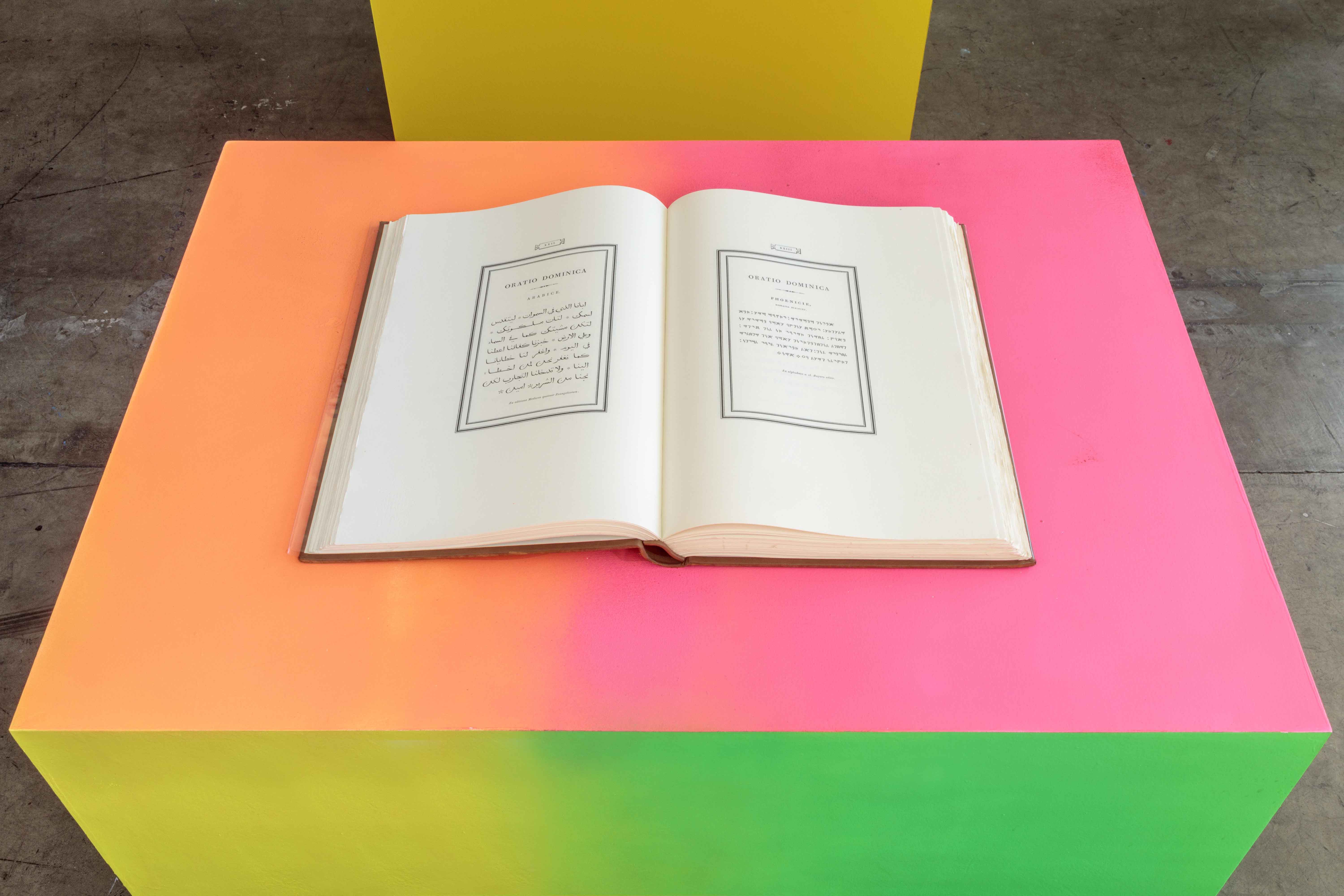
“Slogans in nice typefaces won’t save the human races.” This provocation by British artist and graphic designer Oddly Head set a challenge in motion. His poster, which first pasted across UK streets in late 2017 by Flyingleaps, was a blunt response to what he called “an epoch of demagoguery and debacle.” The slogan spread quickly on social media, its apocalyptic tone warning that humanity itself needed rescuing. The poster became the starting point for “nice,” the 2018 HMCT Typographer-in-Residence project by Lucienne Roberts. nice deconstructed Head’s provocation, asking what power slogans really hold, what counts as a “nice typeface,” how text and typography shape each other, and what dangers we imagine the human race must be saved from. In essence, “nice” is an exploration of the ways that slogans (or texts) in nice typefaces might save the human races after all. The exhibition was the final presentation of Roberts’s residency, which included her research and design work alongside books and artifacts connected to the theme. | Project origination, curation, and art direction: Lucienne Roberts |