I first became aware of the work of Wolfgang Weingart whilst studying at Bath Academy of Art in England around 1979. Benno Zehnder, the Head of the Graphics Department, was Swiss and had installed a framed black-and-white Weingart poster at the top of a staircase. It must have been one of the early Kunstkredit works. It was so fresh and radical and mesmerizing. Subsequently, I learned from Benno about Weingart and his teaching in the new Weiterbildungskurs (advanced graphics course) at the Kunstgewerbeschule (school for applied arts) in Basel, Switzerland. I applied, and in 1982 I was in Basel learning typography with Weingart, design and color from Armin Hofmann, letterform design from Andre Guertler and Christian Mengelt, drawing from Kurt Hauert, and symbol design with Max Schmidt, all masters of their craft. Weingart’s classes were both basic and rigorous, but, in a way, I learnt more from his spirit of experimentation combined with order, which comes through in his work. He was always kind and generous with his time and a convivial companion in evening sessions at the Fischerstube.
My friend and colleague Hamish Muir had also attended Bath Academy and the Kunstgewerbeschule in Basel a year ahead of me, a few years before we started the 8vo studio in London. Leah Hoffmitz, in whose honor the HMCT is named, was also a student of Weingart’s in Basel and later a fellow typography teacher at ArtCenter with whom I could swap Basel anecdotes. The international students who attended the post-graduate course in Basel ensured that his work and teachings became influential, especially in the United States, where he lectured frequently.
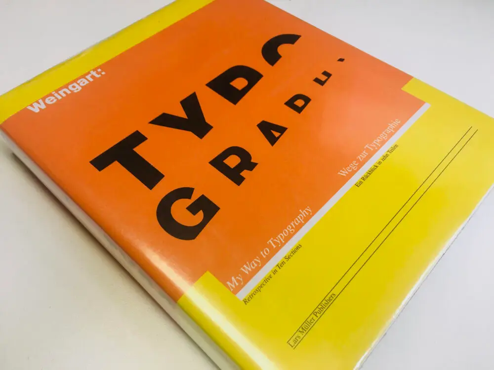
This article is not the place for a survey of his entire career. For that, we have his own words in the substantial autobiographical volume Weingart: Typography published in 2000 by Lars Mueller, as well as the 2014 Weingart Typografie exhibition catalogue from the Museum für Gestaltung Zürich. Rather, I would just like to share some personal observations on his work and influence from the perspective of having been first a student of his, then a practitioner and teacher of typography myself for over thirty years.
Whilst any designer would be happy to be associated with one radical new graphic move, I see not just one but two leaps forward in Weingart’s work. The first involved finding new ways of working with existing letterpress printing technology: he used non-standard letter and word spacing, printed the base ends of inverted type, tied groups of letters together in random ways, and literally bent the rules—the usually straight metal lines—and printed them; all irreverent moves designed to counter what he perceived as “the inherent limitations of perpendicular composition in lead typography.” In these efforts, he was a calculated contrarian, deliberately looking for ways to push against what he saw as the emotionally cool, austere typography of the work of his predecessor at Basel, Emil Ruder.
The second revolution was Weingart’s utilization of film collage as a design tool, made possible by his adoption of a PMT (photomechanical transfer) camera used to prepare films for offset printing. It is worth noting that the experiments and developments he was able to make in his work took place, not in a commercial environment, but in the workshop and lab at the school in Basel, a reminder of how important it is that educational establishments can and should be places of pure research, freed from commercially-driven imperatives. With a well-equipped letterpress shop as well as a darkroom and film materials, he was able to set, print, photograph, and enlarge type, pull it out of focus, use halftone screens, and layer images in a collage of film. This was Photoshop before Photoshop—the advance guard of what was to become layering in computer files. In retrospect, Weingart’s film collage work is the historic bridge spanning the 500-year-old letterpress tradition and the fluid freedoms of the new computer age.
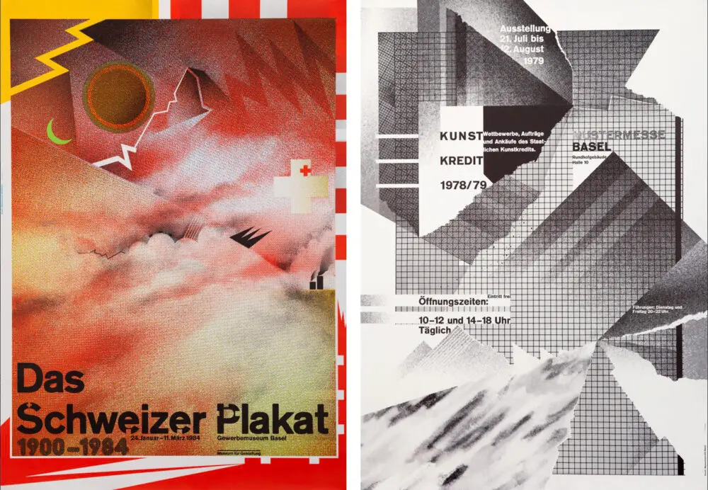
I think it is also important to note that both of these progressions grew out of his immersion in the working process and the materiality of metal type and film. As he said himself, “After many years I became aware that my best ideas were inspired by the mechanics of a procedure. Rarely did I attempt to implement perceived ideas; instead, I navigated the process towards a result, which often led to unimaginable discoveries.”
His teaching lives on in plain sight, particularly in a series of posters from 1977–84, which combine the expected rigor of Swiss typography with a raw, almost punk approach to image and collage. In his work, there is always a composed balance between structure and anti-structure—a dynamic state of suspended graphic animation—as well as a refined armory of what became signature graphic tropes: diagonals / altered type / out of focus type/ step shapes / torn edges / halftone screens. He could be called a maximalist rather than a minimalist, building upon, but moving away from, what he saw as the somewhat puritan reductivist typography taught by Emil Ruder and others in the Swiss typography tradition. Weingart’s experimentation (the addition of the gestural, the material, the personal) not only radically changed the idea of what Swiss typography could be but was fully supported in the college by course leader Armin Hofmann.
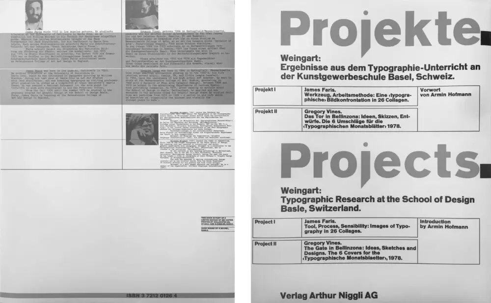
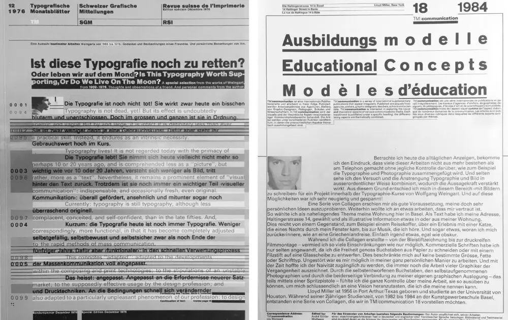
Weingart was very supportive of his students’ experimental projects and published many results, most notably in the book Projekte published by Niggli, featuring the work of James Faris and Gregory Vines and the TM Communication series, a side project from the Typographische Monatsblätter. In a way that rather sums up Weingart’s career, Armin Hofmann wrote in the foreword to Projekte: “In Weingart, a further teaching personality carries on the new Basel typographic tradition from Tschichold, through Ruder, and into the new age.”
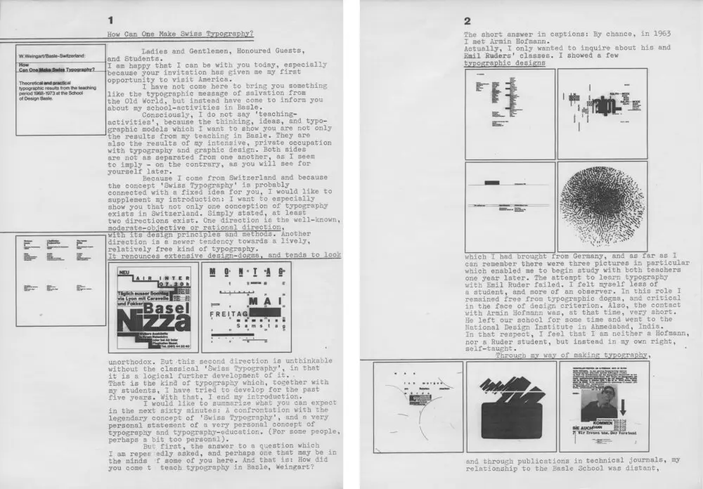
In 1987, a couple of years after I had started the Octavo journal of typography with my 8vo studio colleagues Hamish Muir and Mark Holt along with Michael Burke, Weingart graciously allowed us to reproduce his lecture “How Can One Make Swiss Typography?” in the fourth issue, Octavo 87.4. This text and the accompanying slide images, previously unpublished and available only in limited photocopied sets, were the basis of lectures he had been giving since 1972. Weingart and his work were less well known in the UK than in the USA, so it seemed an excellent opportunity to share his thinking, especially against the backdrop of the commercially driven design field of the Thatcher period. We reproduced the images with a deep grey background to mimic the feeling of slides in a dark auditorium, but also to highlight the white space in the compositions shown. Weingart kindly wrote a new introduction to the lecture.
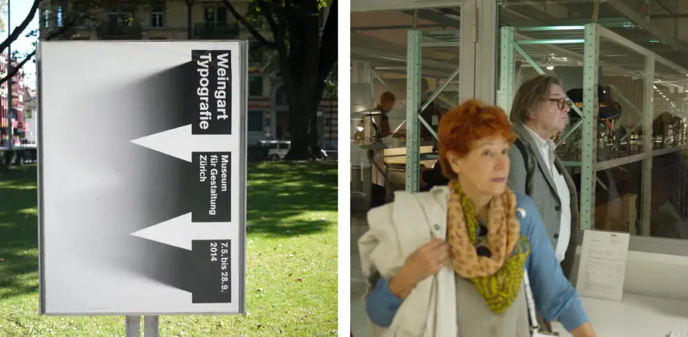
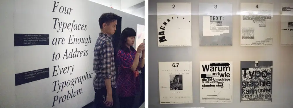
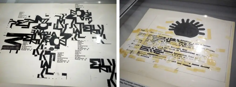
I last saw Weingart in 2014 when I took a group of ArtCenter students from Berlin to Zurich to meet him and see the exhibition of his work at the Museum für Gestaltung. We were able to have a private tour of the exhibition with him and ask questions about the work and his approach. In addition to being able to see many lesser-known pieces of his work as well as some student work, there were powerful declarative statements around the exhibition summing up aspects of his typographic philosophy. It happened to be the same weekend that the incredible new campus of Zürich University of the Arts (ZHdK) was opening at the repurposed Toni-Areal building, which was once Europe’s largest yogurt factory. April Greiman (a student and friend of Weingart’s since the early 70s) was in town as well, and we were all given a memorable tour of the new design museum facilities by graphics curator Barbara Junod. Weingart had not been in the best of health, but his spirit and conversation were as lively as ever, and that trademark haircut had a way of making him seem younger than his age. Whilst we have lost the man, the work remains. He is still teaching. The lessons are in the work.
Simon Johnston
November 2021
Related Links:
Wolfgang Weingart—In His Own Words:
http://www.karografik.ch/seiten/pub_weingart_RIP.html
TM Research Archive:
http://www.tm-research-archive.ch/designers/wolfgang-weingart/
Zurich University of the Arts exhibition and research project:
https://www.zhdk.ch/en/researchproject/wolfgang-weingart-typography-in-context-418328
Wolfgang Weingart 1941–2021
I first became aware of the work of Wolfgang Weingart whilst studying at Bath Academy of Art in England around 1979. Benno Zehnder, the Head of the Graphics Department, was Swiss and had installed a framed black-and-white Weingart poster at the top of a staircase. It must have been one of the early Kunstkredit works. It was so fresh and radical and mesmerizing. Subsequently, I learned from Benno about Weingart and his teaching in the new Weiterbildungskurs (advanced graphics course) at the Kunstgewerbeschule (school for applied arts) in Basel, Switzerland. I applied, and in 1982 I was in Basel learning typography with Weingart, design and color from Armin Hofmann, letterform design from Andre Guertler and Christian Mengelt, drawing from Kurt Hauert, and symbol design with Max Schmidt, all masters of their craft. Weingart’s classes were both basic and rigorous, but, in a way, I learnt more from his spirit of experimentation combined with order, which comes through in his work. He was always kind and generous with his time and a convivial companion in evening sessions at the Fischerstube.
My friend and colleague Hamish Muir had also attended Bath Academy and the Kunstgewerbeschule in Basel a year ahead of me, a few years before we started the 8vo studio in London. Leah Hoffmitz, in whose honor the HMCT is named, was also a student of Weingart’s in Basel and later a fellow typography teacher at ArtCenter with whom I could swap Basel anecdotes. The international students who attended the post-graduate course in Basel ensured that his work and teachings became influential, especially in the United States, where he lectured frequently.
This article is not the place for a survey of his entire career. For that, we have his own words in the substantial autobiographical volume Weingart: Typography published in 2000 by Lars Mueller, as well as the 2014 Weingart Typografie exhibition catalogue from the Museum für Gestaltung Zürich. Rather, I would just like to share some personal observations on his work and influence from the perspective of having been first a student of his, then a practitioner and teacher of typography myself for over thirty years.
Whilst any designer would be happy to be associated with one radical new graphic move, I see not just one but two leaps forward in Weingart’s work. The first involved finding new ways of working with existing letterpress printing technology: he used non-standard letter and word spacing, printed the base ends of inverted type, tied groups of letters together in random ways, and literally bent the rules—the usually straight metal lines—and printed them; all irreverent moves designed to counter what he perceived as “the inherent limitations of perpendicular composition in lead typography.” In these efforts, he was a calculated contrarian, deliberately looking for ways to push against what he saw as the emotionally cool, austere typography of the work of his predecessor at Basel, Emil Ruder.
The second revolution was Weingart’s utilization of film collage as a design tool, made possible by his adoption of a PMT (photomechanical transfer) camera used to prepare films for offset printing. It is worth noting that the experiments and developments he was able to make in his work took place, not in a commercial environment, but in the workshop and lab at the school in Basel, a reminder of how important it is that educational establishments can and should be places of pure research, freed from commercially-driven imperatives. With a well-equipped letterpress shop as well as a darkroom and film materials, he was able to set, print, photograph, and enlarge type, pull it out of focus, use halftone screens, and layer images in a collage of film. This was Photoshop before Photoshop—the advance guard of what was to become layering in computer files. In retrospect, Weingart’s film collage work is the historic bridge spanning the 500-year-old letterpress tradition and the fluid freedoms of the new computer age.
I think it is also important to note that both of these progressions grew out of his immersion in the working process and the materiality of metal type and film. As he said himself, “After many years I became aware that my best ideas were inspired by the mechanics of a procedure. Rarely did I attempt to implement perceived ideas; instead, I navigated the process towards a result, which often led to unimaginable discoveries.”
His teaching lives on in plain sight, particularly in a series of posters from 1977–84, which combine the expected rigor of Swiss typography with a raw, almost punk approach to image and collage. In his work, there is always a composed balance between structure and anti-structure—a dynamic state of suspended graphic animation—as well as a refined armory of what became signature graphic tropes: diagonals / altered type / out of focus type/ step shapes / torn edges / halftone screens. He could be called a maximalist rather than a minimalist, building upon, but moving away from, what he saw as the somewhat puritan reductivist typography taught by Emil Ruder and others in the Swiss typography tradition. Weingart’s experimentation (the addition of the gestural, the material, the personal) not only radically changed the idea of what Swiss typography could be but was fully supported in the college by course leader Armin Hofmann.
Weingart was very supportive of his students’ experimental projects and published many results, most notably in the book Projekte published by Niggli, featuring the work of James Faris and Gregory Vines and the TM Communication series, a side project from the Typographische Monatsblätter. In a way that rather sums up Weingart’s career, Armin Hofmann wrote in the foreword to Projekte: “In Weingart, a further teaching personality carries on the new Basel typographic tradition from Tschichold, through Ruder, and into the new age.”
In 1987, a couple of years after I had started the Octavo journal of typography with my 8vo studio colleagues Hamish Muir and Mark Holt along with Michael Burke, Weingart graciously allowed us to reproduce his lecture “How Can One Make Swiss Typography?” in the fourth issue, Octavo 87.4. This text and the accompanying slide images, previously unpublished and available only in limited photocopied sets, were the basis of lectures he had been giving since 1972. Weingart and his work were less well known in the UK than in the USA, so it seemed an excellent opportunity to share his thinking, especially against the backdrop of the commercially driven design field of the Thatcher period. We reproduced the images with a deep grey background to mimic the feeling of slides in a dark auditorium, but also to highlight the white space in the compositions shown. Weingart kindly wrote a new introduction to the lecture.
I last saw Weingart in 2014 when I took a group of ArtCenter students from Berlin to Zurich to meet him and see the exhibition of his work at the Museum für Gestaltung. We were able to have a private tour of the exhibition with him and ask questions about the work and his approach. In addition to being able to see many lesser-known pieces of his work as well as some student work, there were powerful declarative statements around the exhibition summing up aspects of his typographic philosophy. It happened to be the same weekend that the incredible new campus of Zürich University of the Arts (ZHdK) was opening at the repurposed Toni-Areal building, which was once Europe’s largest yogurt factory. April Greiman (a student and friend of Weingart’s since the early 70s) was in town as well, and we were all given a memorable tour of the new design museum facilities by graphics curator Barbara Junod. Weingart had not been in the best of health, but his spirit and conversation were as lively as ever, and that trademark haircut had a way of making him seem younger than his age. Whilst we have lost the man, the work remains. He is still teaching. The lessons are in the work.
Simon Johnston
November 2021
Related Links:
Wolfgang Weingart—In His Own Words:
http://www.karografik.ch/seiten/pub_weingart_RIP.html
TM Research Archive:
http://www.tm-research-archive.ch/designers/wolfgang-weingart/
Zurich University of the Arts exhibition and research project:
https://www.zhdk.ch/en/researchproject/wolfgang-weingart-typography-in-context-418328
SUGGESTED ARTICLES
College Book Art Association 2025 National Conference
A Visit to Tipoteca in Italy
The Daily Heller on Quasi